Blog

SteadyMed Therapeutics Progressive Web App
PINT worked with SteadyMed Therapeutics, Inc. to redesign and refactor its site as a Progressive Web App with a more prominent focus on its primary offerings.
SteadyMed is a specialty pharmaceuticals company developing drug product candidates for the treatment of diseases, such as Pulmonary Arterial Hypertension (PAH). SteadyMed maintains an active community presence, serving as an informational resource for those affected by PAH, and frequently participating in events to raise awareness of PAH.
Client: SteadyMed Therapeutics, Inc.
Location: San Ramon, CA
Industry: Pharmaceutical
PINT Services: UX/UI, Information architecture, design, image research, front-end development, quality assurance, security consulting, marketing
Technology: HTML, CSS, JavaScript, Web Components via Polymer, Google App Engine Hosting & Deployment
Challenge
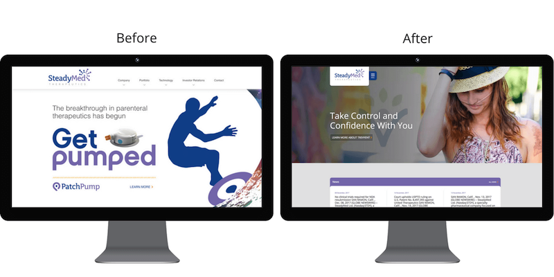
SteadyMed sought out a new look for its website to showcase its identity as a fun, edgy, and most importantly, patient-focused company. Contrary to a more rigid, corporate appearance that is typical of many pharma websites, SteadyMed preferred a trendy, design-forward appearance that would better represent its primary offerings and future direction to patients and investors.
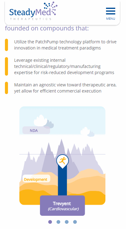
The NDA submission for their investigational drug product, Trevyent, in June 2017, was the primary driver for the website redesign effort. The company had progressed significantly since the last iteration of the website and it was time for a change.
Solution
IA & Design
PINT developed a site structure and visual design to exhibit this tone, while also maintaining SteadyMed’s existing branding and color palette.
Full-Screen Navigation
One example is the use of the full-screen desktop menu, a unique, but steadily growing design trend. PINT and SteadyMed explored standard horizontal and vertical menus, before landing on this full page navigation, enabled by a hamburger menu icon.
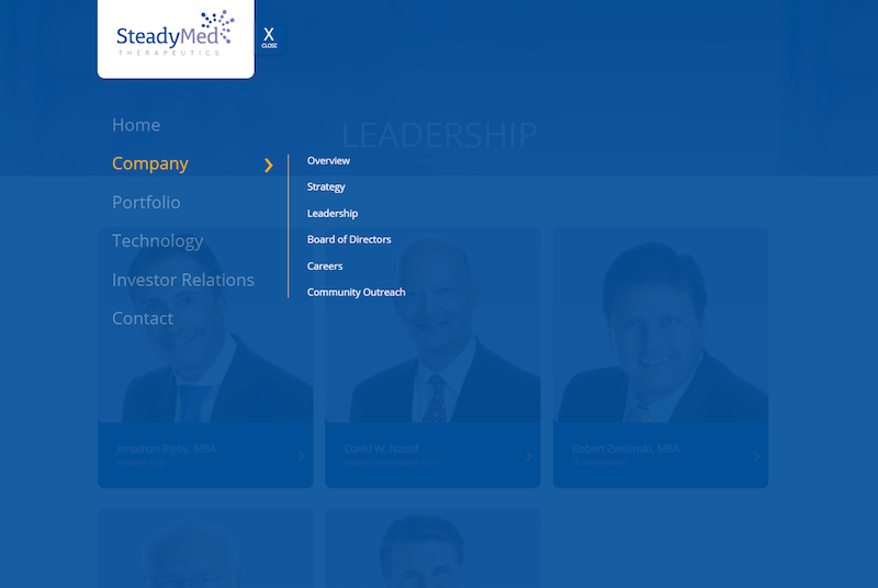
This design and architecture direction provided for a modern look that simplifies and declutters webpages.
Some caution should be exercised when applying a layout like this, as there is potential for confusion among less tech-savvy users and risk for a loss of accessibility. To maintain clarity and ease-of-use, descriptive labeling (i.e. the use of text, ‘Menu’ and ‘Close’) and clear, prominent calls-to-action (CTAs) were used to support the user experience.
In fact, CTAs, in this case, can be even more effective in guiding users towards focal points of the website, without the distraction of a full menu persistently in display. With the NDA submission for Trevyent, SteadyMed saw a significant shift in focus from the PatchPump product to Trevyent. The new homepage design clearly prioritizes both Trevyent and News sections of the website, with these CTAs prominently displayed.
Tiled/Modular Layout
Another visual update to the website is the tiled content layout, prominently featured on the homepage. After PINT compared several pharma and out-of-industry sites, SteadyMed’s modular layout was ultimately inspired by sites such as Goop (lifestyle site) and Johnson & Johnson. This approach is not only aesthetically appealing, but this versatile layout also allows for future flexibility to add and re-prioritize content.
The website was built to display and function properly on different device sizes. For certain content blocks, PINT implemented adaptive styling, so that content can appropriately adjust for different devices. For example, the news section, which is displayed via three horizontal tiles on desktop, adapts to a horizontal slider when viewed on mobile-sized screens.
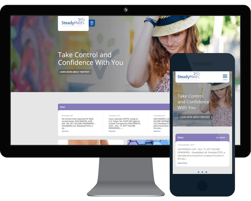
On mobile devices, a user may view content by interacting with these sliders to review hidden content. Compared to the alternative of stacking the three content blocks, this implementation preserves valuable vertical space on mobile screens.
Technical Refactor & PWA Methodology
This redesign also provided an opportunity to refactor the website’s technology.
SteadyMed’s new website was developed as a Progressive Web App (PWA) to optimize performance, increase accessibility, and support offline capability.
While building the site, PINT applied best practice methodologies in order to achieve these goals.
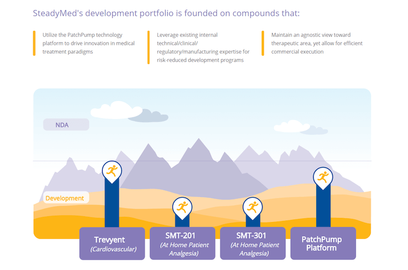
The product pipeline graphic, for example, was built as a Scalable Vector Graphic (SVG). SVGs are optimal for their small file sizes, delivering significant performance enhancements over photo files. Unlike an image file, an SVG, when built properly, can programmatically adjust its display across different screen sizes.
Other visuals on the site utilize a WebP image format in supported browsers (such as Chrome and other Google products). WebP images can be around 25% smaller than a standard PNG or JPEG image, resulting in a faster end-user experience. An evaluation of SteadyMed’s website analytics in December 2016 vs December 2017 showed that site visits via Chrome browser increased from 56% to 71%, making the implementation of WebP images ever more important.
Results
While it has not been long since the site launched this past November, some immediate improvements have been observed. For instance, in a comparison of December 2016 to December 2017, traffic to the SteadyMed site saw a 54% increase in the number of sessions.
Moving forward, PINT will continue to monitor standard indicators of success, such as overall traffic, page speed, distribution of page views and etc. PINT will also track certain events specific to the SteadyMed site.
For example, PINT is tracking form submissions through Google Analytics ‘Goals’ tool to measure the success of all form types on the SteadyMed site: job application, Trevyent inquiry, and general inquiry. Data like this provides valuable insights for future testing and iterations to the SteadyMed site, for continued improvement.
If your site isn’t sending the message you need, PINT can help you refocus. Tell us about your project today.
Related Articles

5 Key Findings from a Recent Client Usability Study
Introduction Good usability within a website means that the user is able to use the interface to complete her/his tasks quickly and successfully. It is...
EDCO App Design and Development
Introduction Remember back in 2007 when Steve Jobs told us that iPhones didn’t need a bunch of apps? No? You’re forgiven if it’s been lost...

N.A.M.I. San Diego App Development
Project Summary Since 2020, PINT has helped N.A.M.I. rearchitect and continuously improve its mobile applications oscER, oscER jr. and alfrEDU. The apps were initially rearchitected...