404 Pages – Best Practices and Examples
Web developers try to keep everything running smoothly and make it easy for users to find specific pages. But sometimes you just cannot avoid running into an error page online. And while encountering error pages can be a major disappointment, some organizations are using them as an opportunity to affect the user experience while keeping users engaged. And they are doing it in some creative ways.
Before we look at some unique 404 examples we’ve included in this post, let’s take a few moments to review some best-practices.
Best Practices for User Experience
Place your message at the top of the page
Eye tracking and online reading studies have shown that the top left part of the screen is where users typically look first. So place your message for them about why they’ve reached an error page in this prime real estate, while giving them options for navigating to more desirable or targeted areas of the site.
Explain What Happened
In Designing Interfaces, Interaction Design Consultant Jenifer Tidwell recommends putting a description along with the error number to reduce confusion for users. This makes sense, as most people outside of the web development industry likely would not know the difference between a 301, 400, 404 or a 500.
The messages should be short, but detailed enough for the user to understand why they reached the page. Using human language instead of computer jargon is also helpful. For example, “403 Forbidden” might be a startling message for some users. But explaining that it is a server response issue might soften the message a bit.
Be Polite
This relates to using human language, but it is a nice touch to say “please” or “excuse us” when appropriate. If the error is your fault, you might consider taking the blame, although there is some debate about whether or not to apologize in error messages.
Another way to be polite is to offer an alternative for users to take when they’ve reached an error page. It could be a link or a list of options.
Make it Quick
Don’t make people wait for a page to load, especially when it is an error page! Being creative with these pages is a fun idea, but any benefits from such creativity would be greatly reduced by the resulting negative user experience of a slow page load.
Fun 404 Page Design Examples
Virgin.com

Hey, as long as as the boss signed off on this, Virgin.com’s 404 page shows the company’s cheeky sense of humor (while also apologizing, using human language, and giving the user some options for how to proceed). Richard Branson is many things: a successful entrepreneur, business leader, philanthropist and now…a 404-page icon (in drag). There is definitely a slight shock-value, as well as a certain level of humor associated with this error-message because this would likely be the last thing one would expect to see when mistyping a URL.
UrbanOutfitters.com

Urban Outfitters’ website is rich with edge-to-edge graphics throughout their catalog of hip clothing, yet their 404 is simple and direct. Although they make nice use of some of the best practices mentioned above– including a page that matches their site branding and an informal message that matches the company’s offerings– the text shown in this image is actually one large clickable-image. Some room for improvement might include adding a site-map and specific links, as it’s possible to make this a bit more user-friendly.
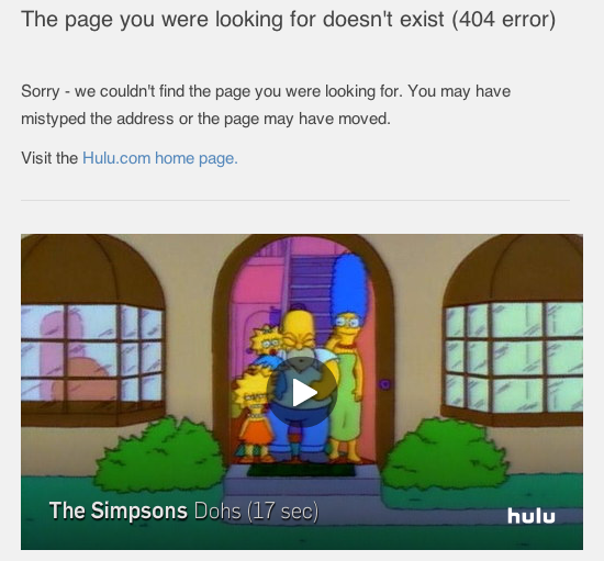
Hulu.com

In this example, Hulu chooses to use the apology approach. The brilliance is in the simplicity because they are using their site’s (video) entertainment content to spice up the page and keep it fun.
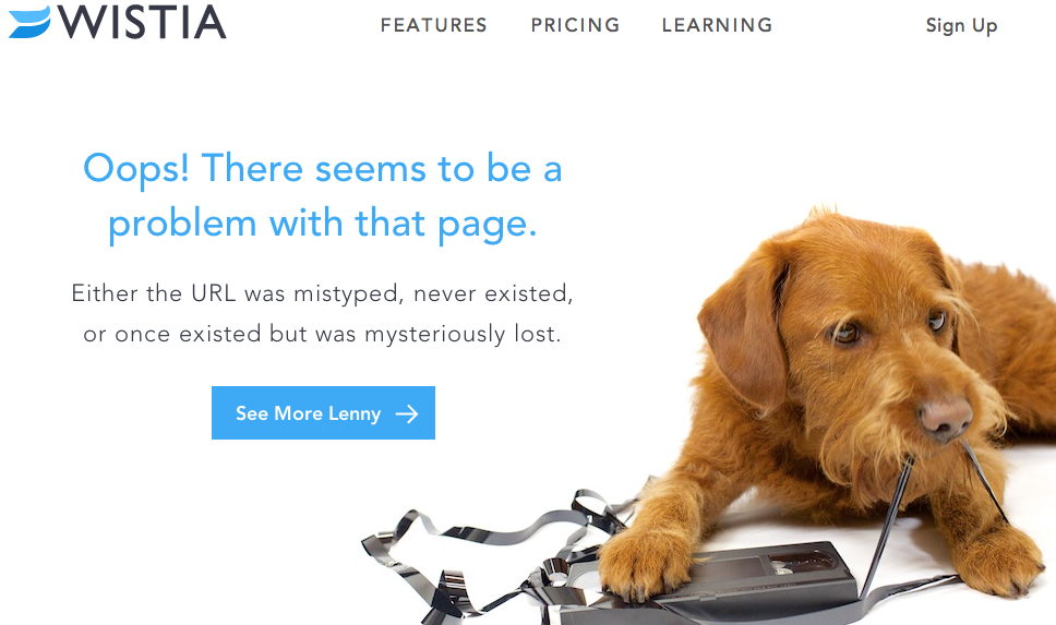
Wistia.com

There is some very informal language here on Wistia.com’s 404 page, but the company is obviously using this page as an opportunity to show some of their organization’s personality and literary wit. If the user clicks on the CTA, “See More Lenny”, they are taken to Wistia’s product page which happens to include an in-page video of “Lenny” running off with with a VHS tape. This is a great example of keeping the 404-page fun and relevant to the branding or page messaging throughout.
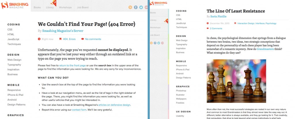
SmashingMagazine.com

Smashing Magazine’s 404 page (left) looks a lot like a regular blog post (right). But there are some clever details on the page that may appeal to readers who visit Smashing often.
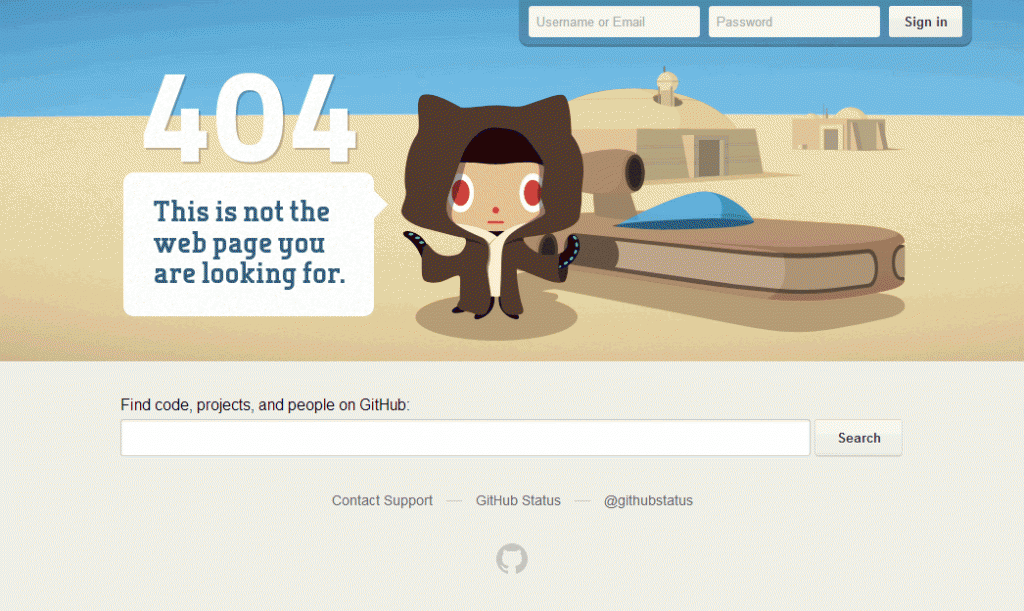
GitHub.com

This example from GitHub has an interactive, parallax-illustration which moves around with perfect fluidity in relation to the user’s mouse movements on the page. Or, perhaps it’s The Force (most likely the latter). Some notable user-friendly elements include the large search bar just below the 404’s hero image in addition to user login seen prominently in the top-right of the page. In short: it’s fun, to the point, and a noteworthy example of giving users a quick smile and getting them back on track.
Response Status: 200 OK
Have you encountered 404 pages that didn’t make you wince? Are there additional suggestions you have for how these pages should be designed? Share your thoughts with us in the comments section below or tweet us @PINTSD, we’d love to see them!