
In’s and Out’s of Comping Text for Web Browsers
Text can be a tricky thing to design for the web; there are many limitations and misunderstandings about the presentation of it. It’s important to understand these limitations and manage the visual expectations fairly and accurately.
Implementation
There are 3 main ways to represent text on the web.
HTML Text
This is text that a developer will place in the code, style with CSS and a user’s browser renders. Users can select, copy/paste it and search engines eat this stuff up.
What’s Bad: We are limited to using a few default fonts that you assume a majority of users have. Here is one helpful font surveys:
http://www.visibone.com/font/FontResults.html
Images
A designer can create a graphic representation of text in software such as Adobe Photoshop. He would then save it out as a jpg, gif or png and place that image into a webpage. Here a designer can use any font they have available.
What’s Bad: Changing and updating images takes a great deal of time compared to updating HTML text. Users can’t highlight, copy/paste the text. Search engines can’t index the text in an image (of course you can retype the text of the image in an alt attribute or long description). File size becomes an issue when we’re dealing with creating the image and also code to account for search engine indexing issues.
sIFR
This method involves JavaScript, flash and CSS. A developer will type in the html text into the code and this method dynamically replaces the text with a small flash file with a font embedded.
What’s Bad: The users browser must download the flash and the JavaScript files. sIFR has a hard time maintaining font-size consistency when dealing with multiple lines. It has trouble with character entities and handling links around the text (I believe the sIFR of the future is addressing some of these issues).
Rendering Limitations with HTML Text
Browsers render HTML text differently. For a long time the main difference in the way it was rendered was operating system-based. Macintosh computers render text anti-alias whereas on the Windows OS text was rendered alias.
With the introduction of Windows XP came ClearType technology. This setting made text on the Windows OS appear anti-aliased. You can also turn this on and off in IE 7 only or system wide. More recently Apple launched a beta version of Safari for Windows. In this release, text is viewed anti-aliased just as if you were on the Mac OS.
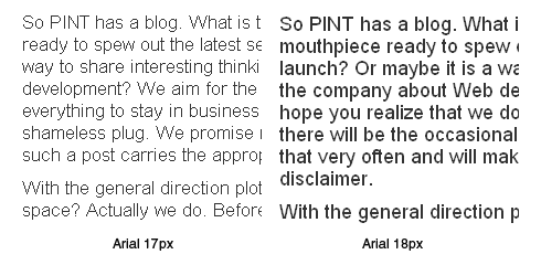
Also important to note is the font-size at which text in a browser that is typically aliased becomes anti-aliased. The magic number is 18px for the majority of the most common system fonts.
Another variable is the font itself. Helvetica, for example, renders anti-aliased even while other fonts render aliased at any size.
Comping practices in Photoshop
The challenge in comping text in Photoshop comes when we attempt to strike a balance between designing an attractive website and representing text accurately as it will appear in a browser based on the best implementation choices for the site. The comp will end up being saved as a jpg file and placed into an HTML page so when a person is viewing the comp they will be able to see how it will appear in a browser.
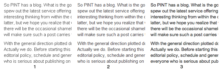
The image below shows HTML text viewed in 1) Firefox, 2) IE with ClearType turned on and 3) Safari. You’ll notice 3 fairly different looking blocks of text.
So how do we comp for this in Photoshop? To be clear and cover as many users as possible we comp as though text were viewed on the Windows OS without ClearType turned on. We also take into account the font face, font size and how we plan to implement.
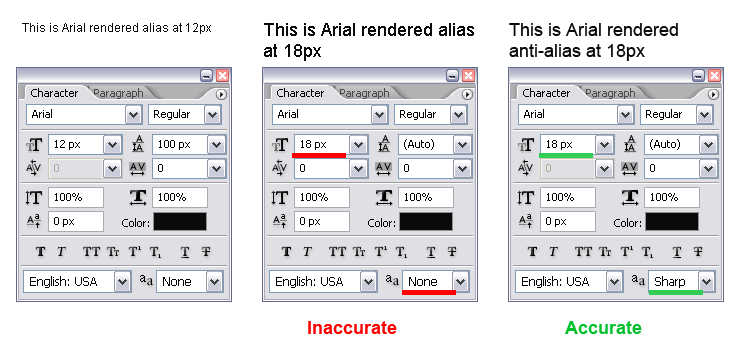
In the image below you’ll see the settings for 3 pieces of text. You’ll notice the anti-aliasing option of “sharp” is the most accurate choice for how HTML text will render at 18px or higher.
We believe in testing rather than guessing; it’s a good habit to get into. If you’re not sure how something will look at a certain size, as a certain font, or in a certain browser, it’s a good idea to create a quick test page. That way you’ll be able to create the most accurate representation of text when you’re presenting your comps. During implementation everyone will be clear about what to expect. Text can be tricky, but with with the proper testing and understanding of the limitations you can take the guess work out of comping text.