Blog
Redesign for Modern Website Browsing
Long time client Conatus Pharmaceuticals is a San Diego-based biotech firm. In 2015, they visited PINT headquarters to discuss redesigning their site. Their current site was designed in 2005 with small iterations between now and then. However, big changes were afoot:
- Updates at the company
- Advancements in their pipeline
- Future plans for programs
All this growth meant the Conatus team’s content, branding, and desired imagery were ready for an overhaul. Read on to see some innovative ways the website redesign not only revamped the content, but updated the entire site for modern browsing techniques.
Modern Website Browsing Techniques

What do we mean by modern website browsing techniques? We mean how internet users are really using the web, rather than how people think the web is used based on outdated research and misguided assumptions. To us, modern browsing includes:
- A clear call to action (CTA) on key landing pages
- Dynamically-generated content for the most up-to-date experience
- Responsive web design that serves users on the spectrum of devices, from mobile phone to cinema display
- Delivery that serves a solid experience across browsers, whether it is Internet Explorer 8 or the latest stable Chrome build
- Minimization of screen refreshes where possible and when screens are repainted an emphasis on guiding the eye rather than “flashing” the load
- Organization that is easy for users to navigate and accommodates future growth in content and functionality
- Long scrolling design in cases when users actually scroll
- Tabbed design for the times when users do not scroll
- Acceptance of less patience for page load but with higher user expectations for presentation
- Flat design where it make sense for usability and performance
Essentially, the team asked themselves, “How do people access information now?” Then they worked to create a design, organize content, and build the site around these behaviors. PINT accommodated how people access information on several levels in this project. Here are some key examples.
Conatus Homepage
The website redesign features some striking and effective updates to the homepage.


Calls to Action
The new design and layout makes space for calls to action (CTAs) on the homepage. This helps move visitors to the pages and content the Conatus team would like them to see most.
Dynamic Content
The homepage is coded to bring in content from the Investor Relations vendor. The advantage this provides users is more up-to-date content that is easily accessed. However, there is an advantage for Conatus team, as well. Setting up dynamic feeds reduces staff time or hassle to update these items in multiple places. They simply share it with the IR vendor and they’re done with the task. In this case, the content includes:
- Stock ticker
- Events, presentations, news links will update dynamically from NASDAQ
Responsive Layout
The new homepage layout is designed to fit all screens without confinement. This updates the 2005 design, which was designed to try and fit most screens before responsive methods were recognized by most browsers. The responsive layout is also aided by long scrolling page design.
Long Scrolling Format
An important goal for the homepage is to educate users on the current state of liver disease and treatment. This required communicating exactly how Conatus is working in the spaces of opportunity to develop the most innovative and necessary treatments. The long-scrolling format of the home page allowed PINT to highlight a few of these key facts about liver disease, and the Conatus team’s unique approach, all while directing users to more specific content within the website.
Navigation
There were a few key improvements that PINT’s Information Architect made during the Conatus redesign to better meet the needs of the company. Because Conatus is in a growth stage, it was important that the new navigation be intuitive. As Conatus adds more programs or begins to address new diseases, the new website will be able to easily incorporate the new content in a way that’s intuitive and easily navigable for users.
In addition, space was designed for search within the main navigation bar. A slick animation effect expands the search box once a user indicates interest in searching.

Mega Footer

Mega footers are not just a way to include keywords on a page for search engine optimization (SEO). According to PINT’s Information Architect Carrie Nusbaum, there is a key user experience benefit.
“Because the homepage is long-scrolling, the “mega footer” provides a convenient failsafe. This is another point of navigation and orientation for users who’ve scrolled down that far.”
Carrie Nusbaum, PINT Information Architect and UX Designer
Design Features
People/patient focus
This is a change from the previous design which featured scientists on the homepage. Despite this shift, it is still clearly the same company. Key elements help carry over the look and feel.
The arrow design from the Conatus logo has been incorporated into subtle, yet highly visible places of the homepage as a motif to provide a gentle reminder of the previous Conatus design.

The Conatus color palette was updated to keep the focus on content and CTAs, while still harkening back to the set used on the previous design.
Ghost Buttons
Ghost buttons are a trendy element in web design right now. However, they fit into this modern browsing project quite well.

In this project, they are appropriate, since they don’t draw too much attention away from the content. However, they are still clearly recognizable as buttons to click on.
Long Scrolling Format Vs. Tabs and Sliders
Designing pages so key content is “above the fold” is a thing of the past. While we definitely try to organize content in a hierarchy, keeping everything in one space is no longer feasible and just not necessary. Advances in Javascript, CSS, and HTML5 opened up more options for displaying long scrolling content. And the data PINT has collected on appropriately-designed sites supports the idea, by showing that users do, in fact, scroll. They key seems to lie in the content presented above the fold. If it is relevant and well-designed, then scrolling is not an issue.
When long scrolling isn’t a good thing

One example of the long scrolling option not being best on this project is the Data/Publications section. The best way to present this type of content was to show the types of data that are available above the fold, rather than scrolling. So PINT’s Information Architect suggested tabs to illustrate these options. It eliminates the need for unnecessary scrolling, and presents the sub categories in a way that is more scannable than the previously-utilized subnavigation on the left.
Long scroll vs. slideshow on the homepage
You might be wondering why the homepage design did not rely on a slider to communicate the key information and CTAs. More and more studies are showing sliders to negatively impact user experience. There are several reasons:
- They can harm performance, and users will bounce from slow-loading sites
- They can resemble advertisements to some users, and will be ignored
- Slider settings– speed, transitions, animations– can cause users to miss key information or lose focus
- They can cause decision fatigue for some users
PINT opted for the long scrolling homepage to counteract these drawbacks and better accommodate the content Conatus wanted to present.
Responsive Web Design
Some of the responsive web design features on the site are well-illustrated on the homepage.

Responsive design implementation codes the CSS of a website to tell the browser how to display items based on how wide the browser is at a given time. Items that are spread across the screen in desktop mode (typically 960 pixels wide) are set to tile when the browser gets narrower (typically under 767px). This eliminates the need for horizontal scrolling, and more intuitively lets users know the rest of the content is displayed below.

One part of the Conatus website where the standard tiling plan is different is on the Data page.
Here, the tabs from the desktop function in a different way. The title tab becomes a navigation button when the browser is smaller. When the user clicks this button, they are presented with navigation buttons for the tabbed categories.
A New Site for Modern Web Browsing
By utilizing responsive design, new user research patterns, and other emerging best practices, PINT was able to redesign the Conatus Pharmaceuticals website in a way that goes beyond a new images and layout. It was not a complete overhaul, but it was a redesign with a great deal of thought and planning. This approach makes the most of an organization’s existing content and knowledge about their unique users. However, it also maximizes the impact of a project with the price tag of a standard redesign.
Wondering how this could work for your website? The PINT team is always happy to chat about new projects and challenges. Let’s talk!
Related Articles

5 Key Findings from a Recent Client Usability Study
Introduction Good usability within a website means that the user is able to use the interface to complete her/his tasks quickly and successfully. It is...
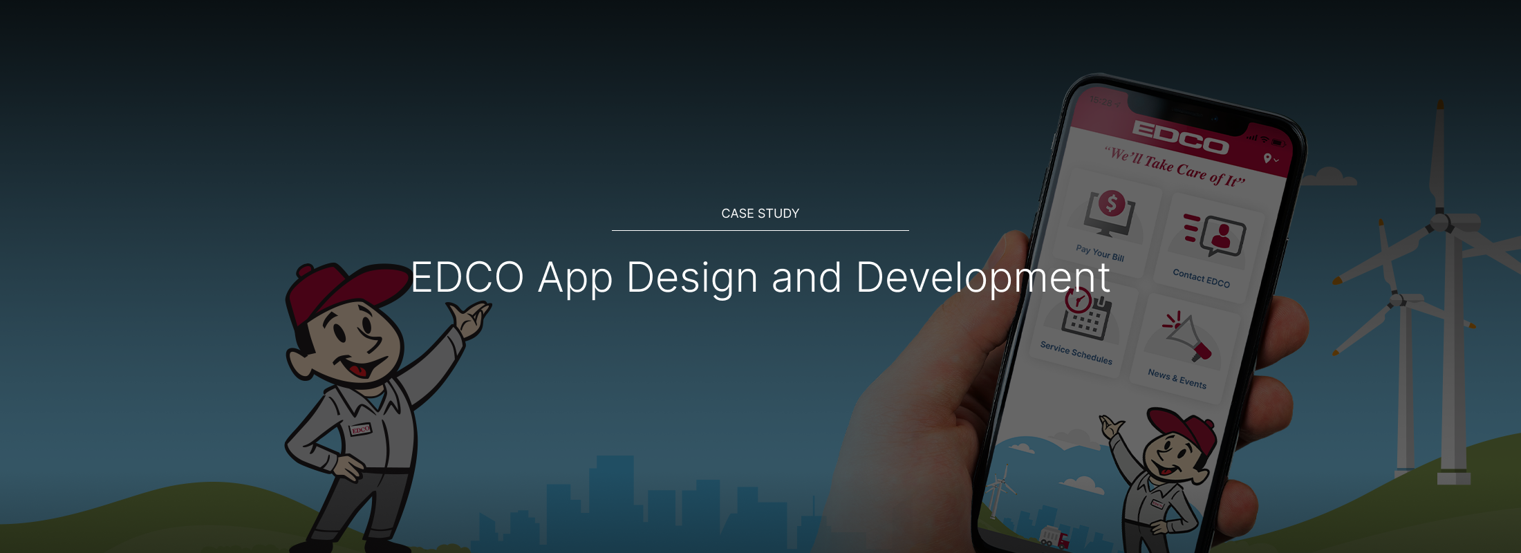
EDCO App Design and Development
Introduction Remember back in 2007 when Steve Jobs told us that iPhones didn’t need a bunch of apps? No? You’re forgiven if it’s been lost...

N.A.M.I. San Diego App Development
Project Summary Since 2020, PINT has helped N.A.M.I. rearchitect and continuously improve its mobile applications oscER, oscER jr. and alfrEDU. The apps were initially rearchitected...