
Reframer Review: A Qualitative Research Tool
I’m reviewing Optimal Workshop’s new user research tool, Reframer. This tool has potential to help us glean more (and more meaningful) information from our qualitative research sessions at PINT, Inc. Here are some key things to know about this product, and user research tools in general.
New UX tools are introduced to market so often it can be hard to keep track of them all. There are many tools that support the actual act of user testing, and many that facilitate design. Relatively few tools, however, specifically support some important steps that take place in between, namely:
- Data organization
- Research synthesis
- Presentation of findings
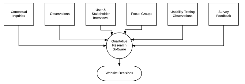
Thorough and meaningful synthesis of qualitative data is indispensable for informing project strategy and design decisions. Without helpful tools, it can be intensely time- and resource-consuming.
The lack of tailored tools for an increasingly necessary process presents an interesting opportunity for the industry. Would a qualitative research product displace more generic tools typically used for qualitative research, like spreadsheets? Earlier this year we participated in a demo for Nasdaq Mosaiq, which aims to fill this need. Now we’re exploring Optimal Workshop’s new research tool, Reframer. Here’s what we learned:
What is Reframer?

Optimal Workshop describes Reframer as “A tool to capture, tag, and rate observations online, in real time. Explore, collate, and synthesize patterns and themes to help make informed design decisions.”
…and that’s pretty much what it does.
In Reframer, you have a collection of projects. There are essentially two sides to any project:
- Data input
- Data output (which they call ‘results’).
Naturally, you begin by adding data.
Data Input
On the input side, each project is composed of research sessions, and each research session is composed of “observations.” Observations are discrete statements that you add either during a research session, or (and probably more likely) after the session, as you review your notes or recordings.
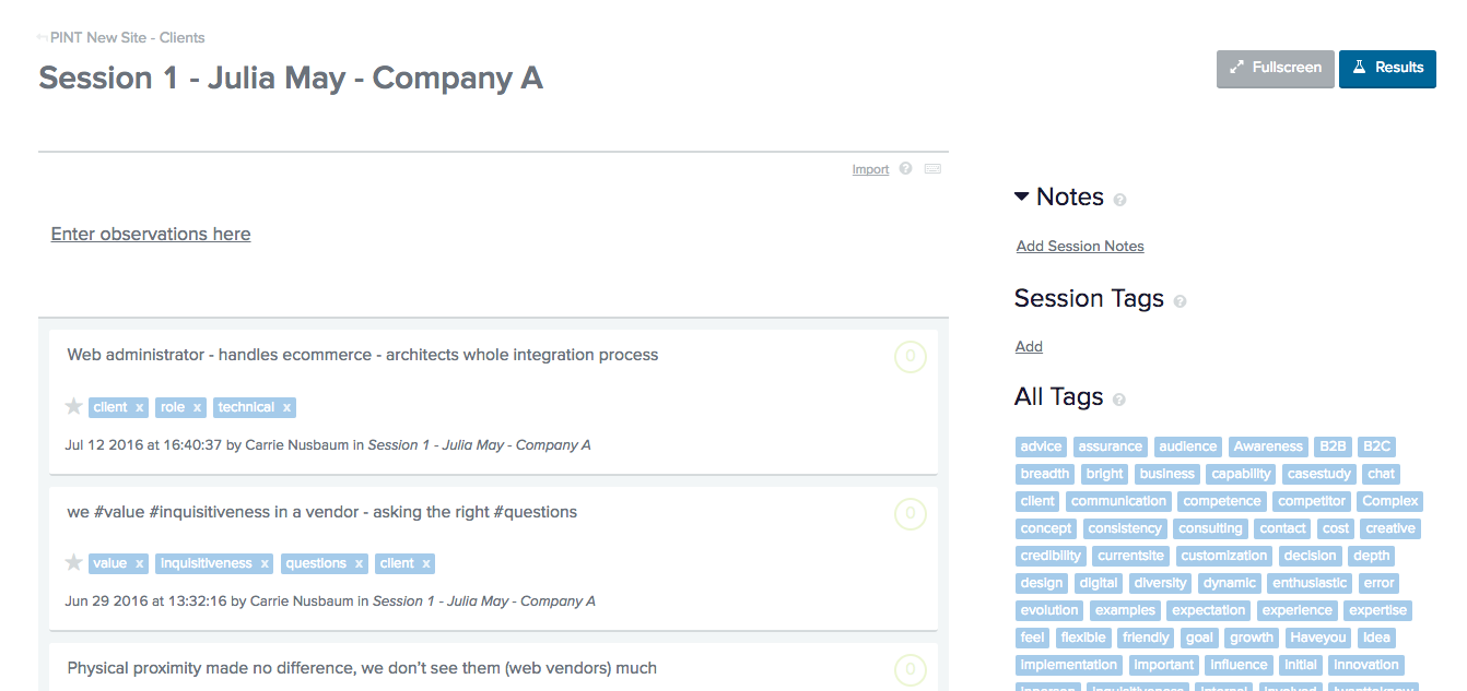
Within an observation, you can add tags either by adding a hashtag before the word, or by dragging and dropping a tag from your tag cloud. You can additionally add a significance rating to weight certain statements over others (disclaimer: we didn’t really use this element in our exploration of the tool).
Research Results
After you enter the observations from your research sessions, added tags, and assigned significance ratings to each statement, you can explore the results section of your project. Reframer provides a few different outputs — different visualizations may yield different insights, or takeaways.
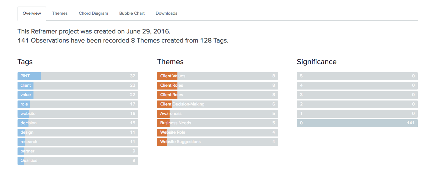
Theme builder
The theme builder is basically a mechanism by which you can create groups of observations based on the tags that they contain. You can narrow or broaden your theme based on those tags.
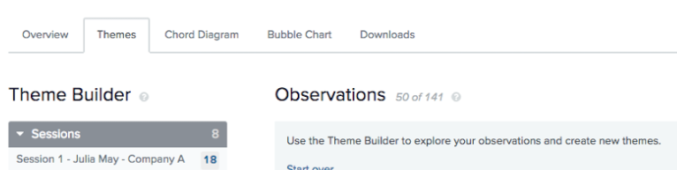
This is a useful feature, however, it’s hard to know exactly how to tag the statements of interest at first. I found myself retroactively adding tags to include them in the appropriate theme groups.
You’d likely work out a better system the more you did this, but it is a less organic method of categorization that traditional affinity diagramming, for instance.
Chord + Bubble Chart
The chord chart displays the high-level correlations between the tags that you’ve added to your observations. This can be helpful for gauging high-level trends — seeing what words users use to describe a given feature, for example.
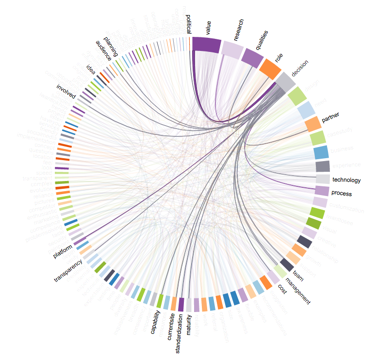
The bubble chart is…of dubious value, IMHO. In theory it could be used to communicate those somewhat soft trends in language use among users or stakeholders. This also depends on your meticulous use of tags.
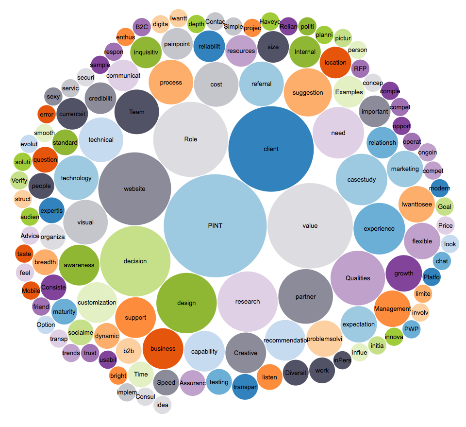
Optimal workshop now allows you to hide certain tags from both the chord diagram, and bubble chart, which does help weed out any irrelevant items or quirks in your tagging system.
XLS export
The tool also allows you to export your input to a .xls file. That’s an important feature since adding data can be time consuming, and potentially risky if you can’t reasonably get it out of a given tool for further analysis. XLS compatibility ultimately allows users to extend functionality using more generic analysis tools.
The Takeaway of Our Reframer Review

While new, this tool is definitely on the right track.
Positive Notes
- Reframer generates an output that’s useful for internal teams and for presenting data back to clients.
- While current output options are limited, they are useful at a high level.
- They also look nice enough to present without any additional configuration. That’s convenient, since further configurations aren’t supported at this time.
- The .xls export feature eases anxieties about adding data to a system, only to have to enter it again to use another tool further down the line.
What We Wish It Did
The biggest issue is the strategy of tagging observations to yield insights. Adding meaningful tags requires some anticipation of the themes you expect to find. At least initially, is:
- Hard to do
- Potentially bias-reinforcing
Optimal workshop might consider combining their existing card sorting functionality (from OptimalSort) to allow for true(er) affinity diagramming of the observations, while maintaining the tagging and rating functionality of Reframer for an even more robust tool.
“Ultimately, the tool is named appropriately. Reframer provides a platform to flexibly explore your own data in new ways — helping you and your team discover new trends, themes or details — considerations that might reframe the way you’re thinking about the problem at hand.”
Bottom Line
Our Reframer review TLDR: Reframer is a cool and useful tool, and we’re curious to see where Optimal Workshop takes it from here.