
Understanding Google’s “Mobilegeddon” Search Changes
Today is the day Google is launching its latest search engine algorithm, essentially changing how search engine rankings are displayed, based on their mobile compatibility. This affects anyone with a website, but the search results are only modified when displayed on a mobile smartphone. And while terms like “mobilegeddon” make it sound like this is the end of the world, we have good news: there is still time to make changes to your site and remove any penalities. Here are the steps to take.
Understand Why Google’s Making This New Policy
The first step toward making the necessary changes to your site is understanding why Google is making this somewhat drastic step. It has been in the works for a while, but today it is the hot topic for pretty much everybody. This video does a good job explaining the “why” behind this new policy:
Google lists mobile-friendly sites first for phone users
In short, Google is using this as a tool to strong-arm the entire internet into optimizing websites for mobile smartphones. Why does Google care? As more and more people are access the internet through mobile devices, they are frequently frustrated by the small type and weird formatting of websites that aren’t mobile-friendly. As a result, these users may move their online mobile phone activities to apps. But Google would prefer they stay in a browser and see Google’s paid ads – which are a huge part of its revenue.
Learn How You Could Be Affected with Mobilegeddon FAQs
Now that the day of the policy change is here, you may find these questions from Search Engineland about the change quite helpful.
Q: Will it impact desktop searchers? Will my desktop rankings drop?
A: No, it will only impact mobile searchers and will have no impact on your desktop rankings.
Q: Will it impact tablet searchers?
A: No, this only impacts searches done on mobile smartphone devices, not tablets.
Q: Is this a real-time or delayed algorithm?
A: Unlike Panda or Penguin, the mobile friendly algorithm is run in real time. Sometimes the mobile friendly label can be delayed in showing up in the search results, but Google will pick up on those changes in real time.
Q: If I make my site mobile friendly today, how long will it take Google to pick up on those changes?
A: Early tests show that it can take anywhere from a few hours to over 72-hours if you do everything right for Google to show your web pages as mobile friendly. I would not be surprised if large sites can take up to a month to be displayed as fully mobile friendly. So make sure your most important pages are indexed as mobile friendly sooner than later.
Take Action Now to Become “Mobile Friendly”
Google has made it easy to test a page to see if it already meets the new mobile search display policy requirements. Pop your URL in this mobile-friendly test right now.
Did you pass?
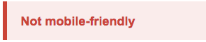
If you received this red message, the page did not pass. And as a result, your site may appear lower in mobile search results. Note: this test only gives results for one page, not an entire website. However, if a homepage fails this test, it’s a likely indicator that the rest of the website would not pass either.
Luckily, Google should have also provided:
- General reasons why your site didn’t pass
- A screenshot of how Googlebot (Google’s website crawling software) sees the page in mobile
- Directions on how to improve your site
This information will help you or your web team – whether it’s an IT department, web agency, or nephew – to get your mobile web presence into Google’s good graces.
How long will it take to get my site up to speed?
The amount of time and resources needed to get your site to pass Google’s mobile-friendly test depends on several factors:
- Which CMS you are using
- Any limitations to your current CMS template or theme
- Past efforts to move toward responsive web design (RWD)
- Any additional visual design considerations your site requires
- The overall compatibility of your site’s content on mobile
None of these items are deal breakers, but they will determine how much planning is needed before actions can be taken to address mobile usability.

If you received this green message, then congratulations! Google will not be moving your site down in mobile search rankings. However, this does not mean you should rest on your laurels. Chances are, your site may still not display quite right in the Google mobile preview. Or there still may be some interior pages that do not display correctly and may be affected by the policy change as a result.
Google Webmaster Tools has a mobile usability tool that indicates any additional non-search-rank-impacting errors that your site may be experiencing.

Get mobile website help from the experts
PINT has been building sites that respond to the size of the browser for years. We can help you identify mobile issues at any stage of the process, from site planning and user experience (UX) to technical delivery and performance.
Making a site mobile-friendly means more than simply making images smaller. It means configuring buttons to work for fingers and maybe even moving elements to keep the screen from getting overcrowded. It’s a complex process with a variety of options, but we’re happy to help. You can post public questions in the comments area below, or give us a call to chat privately at 858.270.2086.