
User Experience on Newspaper Websites

Over the years, the means by which news stories are delivered to the public has changed. While printed stories are not completely obsolete, digital stories have become the way many of us obtain our news in this digital age. Think about what you’re more likely to see in a day: someone with a newspaper in their hand or someone with a smartphone? Bright screens have quickly replaced black and white text.
Despite this change in news consumption, the newspaper metaphor is quite common on the web. News organizations like USA Today have embraced the traditional structure of the newspaper, which includes:
- Highlighting the top news story at the top of the page
- Bucketing the rest of the stories into their respective categories–sports, money, tech, etc.
What does this mean for users? Retaining the newspaper metaphor is not bad for UX, but it could definitely be improved upon.
Benefits of the Newspaper User Interface
The hierarchical approach to news is appealing because it is so familiar. Most literate people recognize what a newspaper is, and have probably read articles on this medium (although that number is quickly dwindling). Nonetheless, this structure makes sense to most readers.
Paralleling this to the original skeuomorphic design of Apple’s iOS applications, users initially like this style. However, user needs and goals must continually remain the priority as the product evolves. Just as the cleaner iOS 7 “flat” design replaced its beveled predecessors, a more user-centric reading experience must replace the newspaper metaphor, especially on the web.
Refocusing on the User
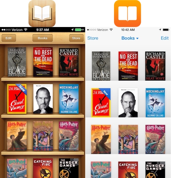
Although the iOS 7 design was met with some initial pushback, users soon discovered the benefits of the new flat design.
- Things simply looked better on a small screen with less visual clutter
- Apps like iBooks removed the literal button design because people already know that the numbers are meant to be pressed.
- The updated design put the user back into focus by giving credit to human intuition.
However, USA Today’s website, like many other digital sources of news, has failed to understand that readers come to a news website to… get ready for it… read news! Visitors come to be educated about what’s going on in the world. That’s their purpose. Extensive user studies are not required to figure that out.
Does USA Today Give Users Enough Credit?
Many web users like bold and bright colors with lots of stimulation. In this sense, USA Today is giving users what they want, especially on the category pages:
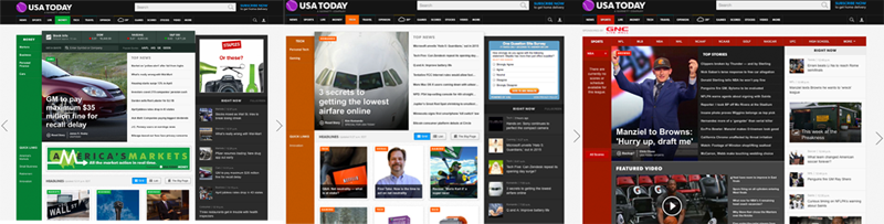
However, in the context of news article reading, most users probably prefer to absorb information without distractions. No user wants to, nor should they have to, experience cognitive overload when reading the news. The news itself will do that half of the time.
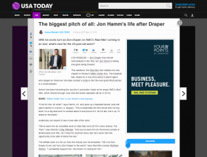
There is a lot going on in USA Today’s homepage, which competes to gain readers’ attention. The overlay feature for individual stories somewhat helps with concentration:
Other Options for Better Usability
The New York Times Skimmer offers a more straightforward approach.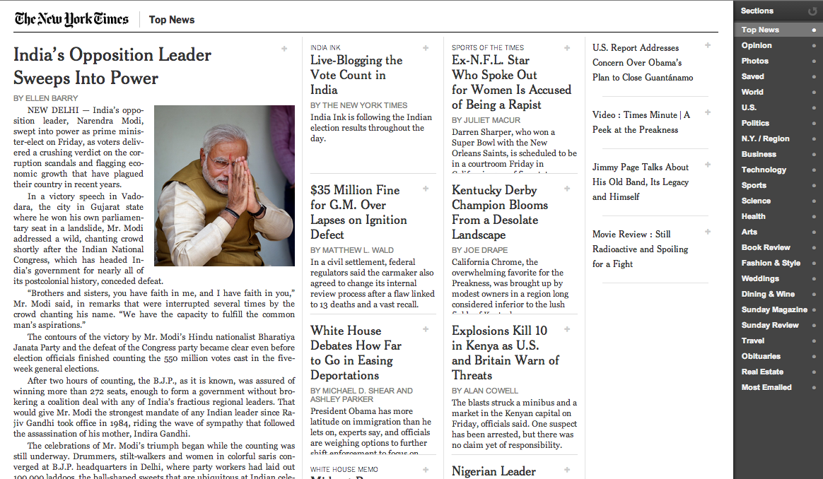
And, it provides users a clear pathway to access content and absorb information.
Even mobile apps like Circa and Zite are doing well at focusing on the user and making content more lean (and more personalized).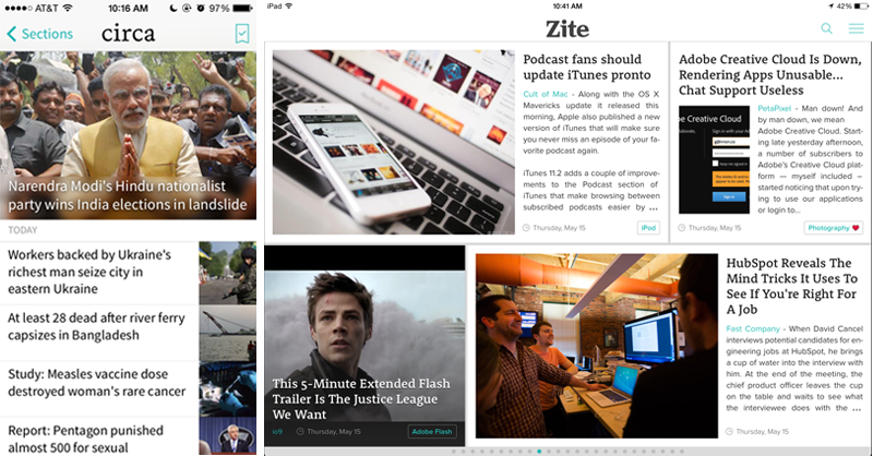
Web Design Implications
Mainstream news organizations would be smart to consider these options.
If they provide a better user experience, then readers will be more likely to stick around and open more stories. This yields three benefits:
- More satisfied users who are more likely to return
- Higher ad impressions and click through rate
- Keeps these traditional news sites from going extinct