
UX Trends: Drunk UX
UX trends come and go, but sometimes we come across one that sticks. What’s the most entertaining UX trend of recent weeks? “Drunk UX” is definitely in the running. The idea is to assess the usability of a site… after a drink or two. We may find it a little more interesting than other firms, after all, our company is called PINT. Drunk UX may sound funny, but could it be a good idea? Let’s find out.
Drunk UX Resources
- Richard Littauer, the guy that runs TheUserIsDrunk.com actually gets drunk and then conducts UX reviews of websites (for a fee), and then posts the screencasts of his reviews on his site. He was ‘working’ from Bali last time we checked.

There are several levels of genius at play here, but first we would like to consider the possibility that all of us could work from Bali. Anyways, if you like Drunk History and UX, this guy is for you. You will either love him because he’s hilarious, or hate him because you should’ve thought of it first.
DrunkUserTesting.com doesn’t even require you to actually get drunk! Which is great for the the under-21 UX set. The plugin blurs text and moves elements around the screen in unpredictable ways. It’s basically a variation on the old squint test, to help gauge the effectiveness of the overall layout of any given site — e.g., are the calls to action visible and logically placed? You get it.
Three Sheets Market Research actually conducts user research on drunk users. That is, they get users drunk, and then ask them to complete tasks on various websites. They even post the videos to their blog!

We have no idea how they are doing this legally, but it is admittedly pretty entertaining, and sometimes even moderately informative.
UX Trends: Why Drunk UX?
Web accessibility isn’t a new concept, but when we think of users with disabilities, we’re generally not thinking of self-imposed disabilities like drunkenness. Drunk people are a unique bunch, and while the number of drunk people on the internet at any given moment is probably disturbingly high, drunk UX is more about what the drunk user represents: the impatient and distracted sober user.
Drunk UX is more about what the drunk user represents: the impatient and distracted sober user.
What are the characteristics of a drunk person? According to this random government document, here are some “Signs of Intoxication.”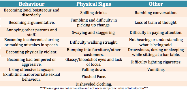
Of particular interest are qualities like, “lack of focus,” “loss of train of thought,” “difficulty in paying attention,” and “not hearing or understanding what is being said.” This guy Will at SquareWeave put together a convenient video about the idea of the drunk user.
Drunk users basically represent users at their worst. Designing sites that are usable for drunk people means designing sites that are usable for sober people who are:
- Just straight up not paying attention
- Multitasking while also looking at a website/app
- Rushing through a given task because they have so much other stuff to do
Classic user, right?
If nothing else, designing for the drunk user is convenient way to keep the UX best practices that you already know and love in mind as you design.
Richard Littauer particularly noticed his distaste for big chunks of text when using a website while drunk — preferring instead to click every option until he gets an idea of what’s going on. This behavior seemed consistent across the videos we checked out. One of Three Sheets’ users repeated, “I have no idea what [this label] means! I’m going to click it” as she was drunk testing an online sneaker customization service.

This preference for poking/prodding makes sense when considering the principles of understanding context that we explored in a recent book review. Experience is key to learning, and since perception of risk is distorted when a person is intoxicated, it makes sense that a drunk person would be more liberal with their clicking.
Context is another issue that comes up repeatedly when observing the drunk users. Making the context of your site clear is especially important when designing for users who are generally less able to orient themselves in an online space (think: “Where am I?” “How did I get here?”).
Drunk UX: What’s the worst that could happen?
While there are definitely perks to testing on users who are actually drunk – like their lack of concern for politeness, and willingness to just say the first thing that comes to mind – it probably doesn’t make sense to test drunk users unless you are designing a site specifically for drunk people. However, watching these videos does provide a little bit of insight into the thought process of the drunk user. This could definitely be helpful in using the drunk user as proxy for the distracted user.
Naturally, you don’t want to be overly reductive to the point of condescension when designing a website with drunk users in mind. “Users are drunk, not stupid!” is the idea here. Finding a balance between brevity and effectiveness is key, and is a solid goal to have in mind when designing any site, for drunk people or not.

We probably won’t be adopting drunk UX as a key strategy any time soon, but we definitely had a good time watching drunk UX videos, and even learned some things about user behavior! So that’s the bottom line: Drunk UX is funny, and not completely worthless, and anything to get us thinking more or differently about users sounds like a pretty good idea to us.
Have you tried drunk UX services? Do you dare share your own drunk UX stories? Bottoms up, then share them with us in the comments below.