
Accessibility on the Modern Web
There’s been a lot of buzz in the news lately about accessibility, specifically in reference to the dozens of ADA lawsuits that seem to be more and more frequent. The internet is well over 30 years old and it has changed a lot: it’s more creative, more aesthetic, and more connected than ever, yet for a significant portion of the population it seems to have only degraded with time.
Are we creating yet another rift in society—those who have easy access to information and those who do not? From minor tasks like checking store hours to important ones like applying for jobs, there’s a reason the UN now considers internet access to be a human right. Accessibility is not a nice to have, it is a requirement.
The Results Are In: Few Are Doing it Right
The latest Accessibility report in the Web Almanac by HTTP Archive tells it all in raw numbers, and it’s bleak. One third of all web pages don’t have any landmark elements or roles on them, 42% of pages have improperly ordered headings, 64% of form fields either use a placeholder as a label or have no label whatsoever, 77% of websites fail to have sufficient color contrast, 71% of websites use px instead of a relative font unit, the list goes on and on.
As an mature society we must prioritize equal access to information. The internet’s original vision was an open platform for discourse and knowledge, and it’s our responsibility to keep this dream alive. Without proactive measures, we risk creating barriers that could limit the internet’s potential for progress and innovation. It’s up to us to prioritize equal access, rather than relying on regulatory interventions or centralized control that could stifle growth.
Why Should We Put in the Effort?
The following is a train of thought I have heard far too often, “Of course we want our application to be accessible, but this level of detail seems unnecessary. Would our time not be better spent working through our backlog and circling back to this when we have time?”
This line of thinking initially seems rational, after all it’s how we prioritize every other feature. The larger the portion of users that need a feature, the higher the priority it gets in the queue. But I don’t believe accessibility should be thought of as a feature, just as how visual design or lack of bugs are not “features”. They are essential facets of every website and app.
One of the driving factors of this question might be in assuming how many of your users have some sort of disability. This is not to say that you should try to precisely determine that number (that’s almost always a bad move, more nuance on that topic in Marco Zehe’s article), but WebAIM conservatively estimates that ~8.5% of the population have some sort of disability that would affect internet use, which is an enormous chunk of users to deprioritize (especially when considering that Firefox and Edge dominate conversations despite having a <8% combined marketshare).
Accessible design reaches farther than that 8.5% estimate though. In many cases, accessible design benefits everyone—games that let you play one handed, subtitles, slip-on tennis shoes—all things initially designed with certain disabilities in mind that found popularity in the general audience.
So how do this all translate to web development? If you’ve ever had direct sunlight beam onto your screen, tried to use your phone after working out your forearms, or perhaps even just waited for your dead mouse to charge, you might have realized just how difficult it is to use sites and apps in less ideal conditions. All of these situations would be covered if the website was designed for users with limited vision or motor control.
Types of Disabilities
When accessibility is talked about online, what often dominates the conversation is a screen reader’s ability to parse a web page. While this is an important requirement and typically more involved than the rest, there are many other types of disabilities.
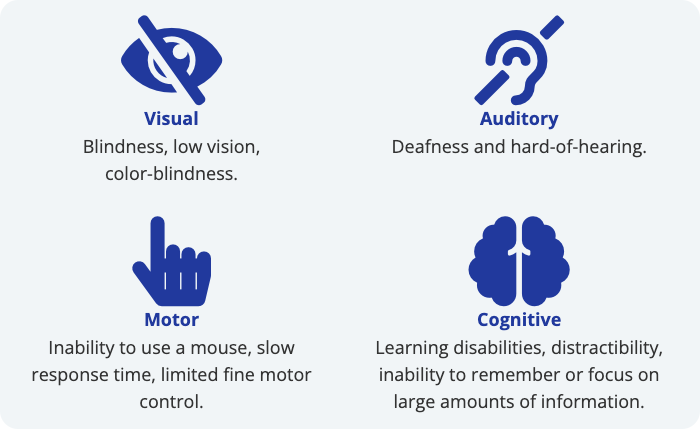
Each type of disability requires slightly different attention from web developers.
- With visual disabilities there are a few different considerations depending on the type of visual disability. For blindness the main concern is the ability for screen readers to parse the markup. For low vision the concern is making sure that foreground & background content on the screen have reasonable contrast with each other. With color-blindness the concern is that color alone is not used to differentiate UI elements from one another.
- With auditory disabilities the primary concern is to make sure that auditory-only content has text alternatives, such as subtitles or transcripts for videos.
- Motor disabilities make it difficult to click / tap on anything too small, moving, or in too short of a time span. Dragging and dropping might also be more of a challenge.
- With cognitive disabilities there are two main things to keep in mind: keep it short and always show the user where they are on the website and what they need to know.
The Specification
Before diving into techniques to make our websites more accessible, it’s important to define the goals we are trying to hit. Without any goals we would be chiseling away for years without knowing if we’ve made any progress. Thankfully the W3C has done this for us in the form of the Web Content Accessibility Guidelines (WCAG).
The current WCAG specification (2.1) is based on four main guiding principles (which form the acronym POUR): Perceivable, Operable, Understandable, and Robust. Each of their guidelines fits into one of these four categories. For each guideline, there is a list of success criteria to determine if your website meets that guideline. Finally there is a letter rating categorizing the importance of that guideline, with the A tier being the most important, bare minimum level of accessibility.
Evaluation Tools
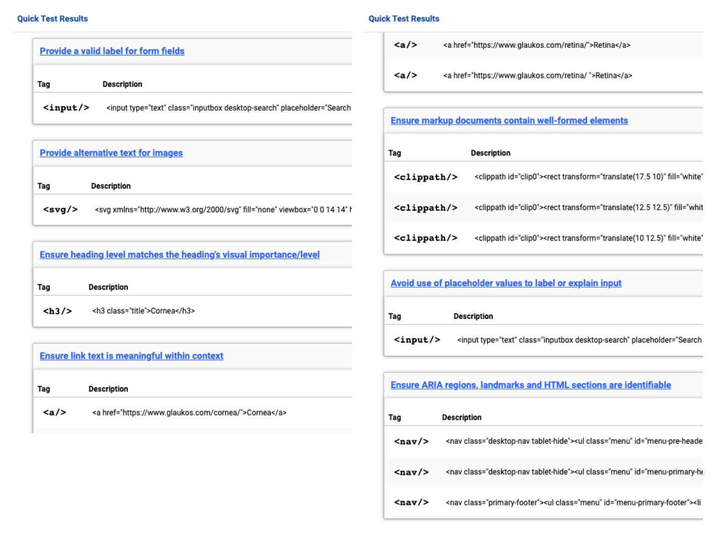
Evaluation tools are a good jumping off point, but rarely do they catch the majority of accessibility issues so their ratings so they should never be relied on alone.
As an example, these two reports came from the same website. The first report being the WAVE Web Accessibility Evaluation Tool and the second being a Lighthouse Audit. Neither tool caught several major issues, but each provided some easy things to fix.
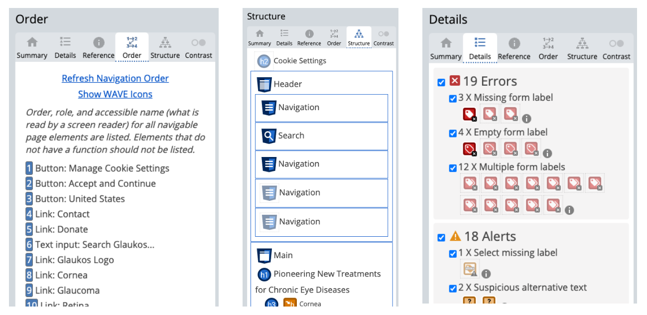
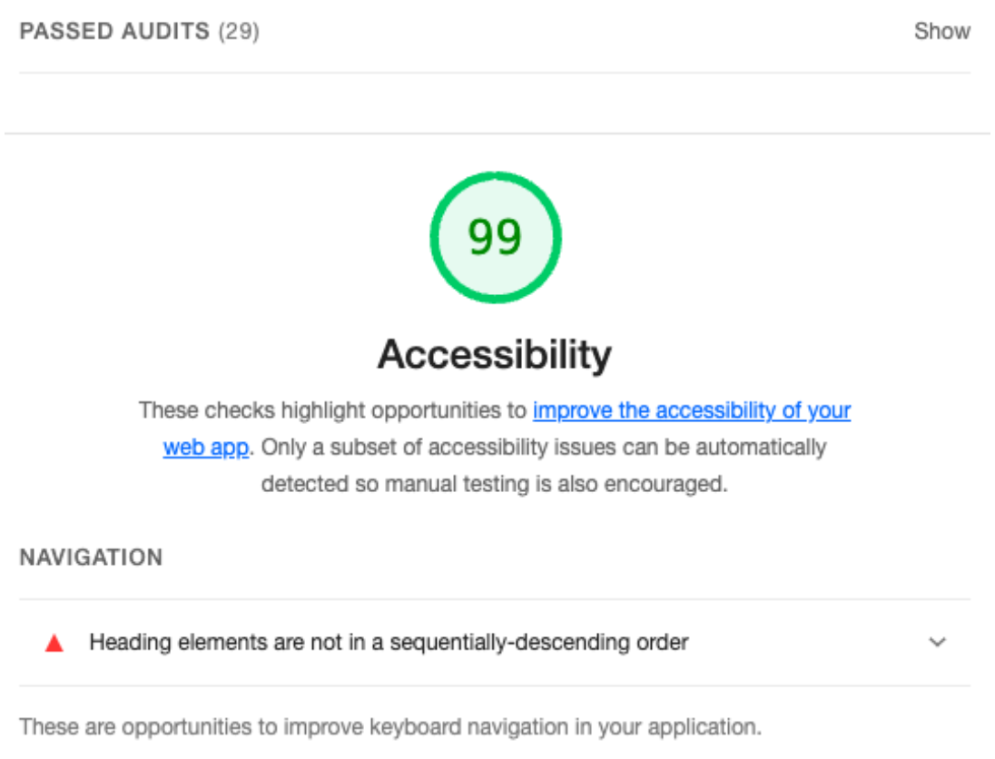
There’s also axe DevTools which provided some nice fixes, but didn’t offer much more than the others in this situation.
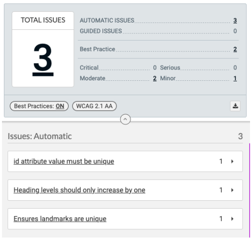
My personal favorite is the Access Assistant Chrome Extension, as it tends to catch the most. To reiterate though, it’s still not perfect nor a replacement for manual testing.
Stop Guessing, Use a Screen Reader
Not all screen readers are the same, and they don’t all implement the WAI-ARIA specification precisely. Without using a screen reader hands on, it’s just a lot of guess work. It doesn’t make sense to go through all of the effort making your content more accessible without validating it with the same tools that your users will.
Just as we cross browser test to ensure visual uniformity, we should all cross screen reader test to ensure a uniform level of accessibility.
Critical Fixes
The following are some of the more fundamental concepts that have to be addressed first and foremost before moving on from screen readers.
Headings: Overview
How do screen reader users navigate webpages? There are many different methods, so as part of WebAIM’s Screen Reader Survey they asked this question.
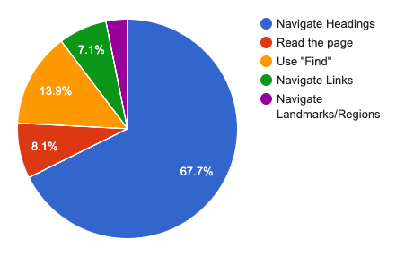
| Response | # of respondents | % of respondents |
|---|---|---|
| Navigate through the headings on the page | 1047 | 67.7% |
| Read through the page | 126 | 8.1% |
| Use the Find feature | 215 | 13.9% |
| Navigate through the links of the page | 110 | 7.1% |
| Navigate through the landmarks / regions of the page | 49 | 3.2% |
It seems that using headings to navigate is most popular by a wide margin. It is imperative then that headings is the first place to start when building or fixing a site. Things to keep in mind with headings:
Headings: Order
- Unless you have multiple entirely separate, unrelated, and equally important sections of a webpage, stick to one
<h1>per page - Heading level must be dependent on the context, not the visual size you want the heading to be
- A subheading must always increase by exactly one level (e.g.
<h2>–><h3>), you cannot skip levels - Sibling sections must have headings of the same level
- You must not use heading elements for subtitles. Headings may only start a new section or subsection, and must not add additional context to another heading.
Headings: Content
- Keep headings short and to the point. If a user is using them to navigate sections, having a long and vague heading will tell them nothing about the section itself and will waste their time.
Landmarks
If we look back on the Accessibility Report in the Web Almanac by HTTP Archive we see that roughly 1/3 of websites are (likely) not using any of the important landmark methods. Even worse for usage of <main> with only 38%. If we combine that with the measly 21% of websites that have skip links available, it’s no wonder why users prefer to navigate using headings. On a large majority of sites, that is the most reliable way to skip down to the main content.
| HTML5 element | ARIA role equivalent | Pages with element | Pages with role | Pages with element or role |
|---|---|---|---|---|
<main> | role="main" | 31% | 17% | 38% |
<header> | role="banner" | 63% | 13% | 65% |
<nav> | role="navigation" | 63% | 22% | 67% |
<footer> | role="contentinfo" | 65% | 11% | 66% |
These are just the top four landmarks, but there are many more enumerated in the HTML5 and ARIA specifications. Scott O’hara has a great article covering them all on his website.
Link Text
We’ve all seen those links, they’re littered on most pages of the web, the ones who cycle through a short list of non-descript phrases: “Read more”, “Click here”, “View more”. Out of context, they’re meaningless phrases. Initially this does not seem like a bit deal, but when you remember that screen reader users are not always reading everything chronologically top to bottom, you cannot expect that everyone will always have the accompanying context for that link.
The even more egregious link text error is that of the full URL. Nobody wants to have a long URL read out to them. At best you can kind of pick up where it goes if it’s a well structured site with a short path, but many many links are long, complex, and have machine-only strings inside them.
Alt Text: Overview
Looking at the Images portion of the Web Almanac report, we see yet more bleak statistics:
- 18% of images do not contain an
altattribute at all, meaning that the filename is read to screen readers - 28% of images have an
altattribute, but the value is empty – meaning that screen readers will treat the image as pure decoration and ignore it - 15% of images have an
altattribute with a value less than 10 words, which is unusually short. Of that 15%, roughly half have the filename of the image inserted again as the value for thealtattribute, which is no better than not having analtattribute. - Only 59% of mobile pages pass the lighthouse image-alt audit
This means that roughly half of all images on the web are accessible only to sighted users. The images were deemed important enough to take up valuable visual real estate, important enough to spend money on bandwidth transporting them to each user’s device, and important enough to affect the performance of the page, but not worth describing to those who can’t see it? Even if the image is a generic stock image, why take that agency away from a user to decide whether they want to listen to the description of that image or not?
Alt Text: How Should I Write It?
This is a monumental topic that deserves its own series of articles (some of my favorites being Jake Archibald’s “Writing great alt text: Emotion matters” and Léonie Watson’s “Thoughts on skin tone and text descriptions”) but the summary is that including a couple of words pointing out what is physically in the picture makes for dry and emotionless alternative text.
If we want to give every user as close to the same experience as possible, we need screen reader users to come away with the same feeling evoked in sighted users by the image. This means we need to convey the emotion of the image, not just the raw image’s contents.
Adding to this, since a screen reader user cannot see a website’s design more emphasis is placed on the copy and the image descriptions to convey the tone of the business.
Alt Text: Inline SVGs
This is a section that does not have any hard statistics attached to it, but anecdotally speaking, is one that is often done wrong. When including an SVG inline, developers often forget that alternative text is still needed and that one can be included using <title>. A short description can also be included using <desc>. Heather Migliorisi’s article Accessible SVGs over on CSS Tricks has a lot more tips for those interested.
Interactability
I also do not have empirical data available to back up this section (unfortunately), so you’ll have to rely on my experience auditing countless websites. Most commonly, poorly-built websites fail to announce when certain elements are available for interaction (either by using semantic elements like a <button> or by having an accessible label). On top of this, even once that element has been interacted with the focus does not change and nothing is announced.
This is a common occurrence in navigation search fields. The scenario usually goes like this: The search input is hidden behind an icon toggle, so the screen reader has no idea an input field is even there. The icon is an <svg> of a magnifying glass that has no <title> so the screen reader cannot tell what the image is. There are click event listeners on the <svg> or its wrapper, neither of which are associated with any ARIA roles, so the screen reader does not indicate to the user that you can interact with the image. Even if the user somehow knew the unlabeled icon was a toggle for the search field, once the icon is interacted with the focus remains on the icon and the new search field that has appeared is not announced, so the user is not sure what just happened.
It’s a mess all the way down, but this seems to be the trend lately. With each layer of complexity and sophistication that we add to our websites we need to be doubling the amount of testing, especially in relation to accessibility.
Progressive Fixes
This section will cover two patterns that I believe are holding the web back not only in terms of accessibility, but also in terms of design creativity.
Carousels
It’s time to retire the carousel. I understand the desire to show off products without the user having to scroll, but they are rarely done well, and even when they are there is little benefit. More often than not they break the WCAG 2.1 Success Guideline 2.2.2 Pause, Stop, Hide (Level A):
Moving, blinking, scrolling: For any moving, blinking or scrolling information that (1) starts automatically, (2) lasts more than five seconds, and (3) is presented in parallel with other content, there is a mechanism for the user to pause, stop, or hide it unless the movement, blinking, or scrolling is part of an activity where it is essential;
Jon MacDonald wrote a great piece going more in depth on the cases against carousels – but to pull a few key points out: most people scroll right past them, users hate losing control over what content they see, and they don’t usually pause on each slide long enough for users to actually read them.
Hover Only Menus
An incredibly popular pattern, especially in navigation bars in the header, but these menus are nothing short of a thinly-veiled cursor gymnastics routine for users. Never sure whether the dropdown is hover-only or requires a click, the menu disappears without warning if you move your mouse just a pixel out of the edge, and often have within even more complex, doubly-nested side menus. On top of all of the motor coordination that’s required for mouse users, many do not respect the :focus state and as such are entirely inaccessible to keyboard users.
With aria-controls and aria-expanded on a <button> toggling lists in an accessible manner is much easier and doesn’t involve hover.
Conclusion
Building websites for only a select portion of the population is a half measure and is not acceptable engineering. Many articles have been written on whether or not Software Engineering is true engineering so I won’t go into it, but to add my 2¢: until software engineers are held accountable for whether or not their software benefits the public good then it is not true engineering. Software Engineers should be following the example set by those in the Order of the Engineer, who upon joining have to take an Oath to abide by a code of ethics. An oath that states specifically “When needed, my skill and knowledge shall be given, without reservation, for the public good”.
So where do we go from here? Looking at the situation as a whole seems like a monumental task, so we shouldn’t try to tackle it all at once. We need to make what we can as accessible as possible, and then share this message with our coworkers and colleagues.