Great Examples of Web Form Design and Validation
The other day Ethan Hackett, Gitamba Saila-Ngita and I were sharing examples of great form validation found around the web. The topic is one I’ve been keeping a close eye on for a while, so I wanted to pass along some thoughts and findings I’ve compiled over time. More importantly, I’d like to continue the discussion and hear what examples and practices you have seen and implemented so we can keep working towards the best user experience possible.
A Little Background on Web Forms
Have you ever submitted a form only to find out after the fact that: a) you missed a required field, and b) the form has now erased some of the data you did actually include? Imagine that experience in “real life.”
Form validation is nothing new. Our CEO Thomas Powell wrote about it years ago. It really addresses a basic principle of “helping people not make mistakes.” As he put it:
“One of the easiest ways to do this is to check the contents of the forms before the user submits them. This is called form validation and can be performed both using a client-side technology like JavaScript or a server-side technology. While a server-side technology may not rely on any particular browser capability, designers should add client-side validation to pages, since they will appear more responsive to a user and avoid the round-trip time to the server and back.”
It no longer takes an early adopter to be influenced by form validation on a daily basis. Anybody who shops, banks, job hunts, or pays taxes online is likely exposed to both fantastic and disastrous forms, and those forms impact more than our ability to complete a task. They impact our view of the company who built them and indirectly either saved or wasted a whole bunch of our time.
Below I’ve shared a couple examples to illustrate who I think is setting a great example of form design and validation. [Note: we have no relationship to these companies.]
Who’s Doing it Right?
Great web experiences should feel like any other great customer service experience. The experience doesn’t have to be fancy, just fast, easy and pleasant. Some companies even take it a step further and end up creating experiences worth sharing.
Hubspot
I’ve witnessed Hubspot continually test and evolve their landing pages over time, and it shows on their latest pages. If you take a moment to fill out the form you’ll notice a subtle and pleasant change in field state. Blue lets you know that the field is in process or OK. Red means incomplete, as you can see in the images below:
![Hubspot form validation example - 1 of 2]](/wp-content/uploads/2025/03/pint-blog-hubspot-form-validation-blue.png) Fields in process “glow” in blue.
Fields in process “glow” in blue. Fields with errors (or incomplete) glow red
Mint.com
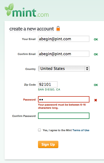
Mint.com is another site that has continually evolved and iterated to end up with strong form validation. Their current sign-up process as shown below is simple visually, but very informative and smart in execution.
 Mint validates fields as they are filled out and provides additional information/help during the process.
### Tumblr
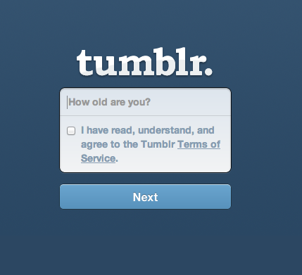
Tumblr takes form validation a step further. Beyond simply validating (their form box shakes itself “no” if you make a mistake and throws an error box indicating why), Tumblr inserts some playful interactions into its sign-up process. See for yourself below or at https://www.tumblr.com/register:
 In-field instructions change once the user starts typing.
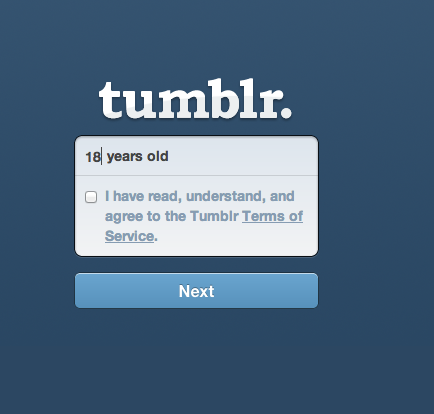
 The site makes filling out its form fun by adding “years old” to your age… but only if you’re below 30 (read on)..
 For the over 30 crowd, tumblr changes “years old’ to “years young.”
The Tumblr example shows what can be done to inject your brand’s attitude into something as basic as a sign-up form. The playfulness works for Tumblr but there are surely other similar ideas that can go above and beyond validation to create a great experience, like adding extra security measures for financial-based forms or auto-filling information that individuals have entered in other stages of the process.
Open Floor
This post is not intended to preach a specific method or style of form design and validation. Instead, it intends to start a discussion centered around user-centric form design and happy users. Because after all, forms are only a necessary means to a desired end: a purchase, a sign-up, a sales inquiry or otherwise. And we all want more ends.
Have you experienced great form design out in the wild? Do share!