
Visualizing the Internet
We here at PINT are big on visualization. Sometimes a picture is worth a thousand words and sometimes well it is just a pretty picture. We particularly like when technical ideas such as network utilization, tables of scientific data, volumes of site traffic, and so on are presented visually and made both informative and pleasing at the same time – form doesn’t just follow function it should follow data.
Unfortunately information aesthetics are far from undestood and often its aims fly in the face of the information. As an example of the constant strain between motivating image and informational value let’s tackle the tough problem of visualizing the Internet.
We can start with a simple idea – a map. The “tubes” of the Internet are still fairly physical, be they undersea cable, satellite link or phone line we can and plot their start and end points. Focusing on the major backbones of the Internet we can build at least a high level understanding of the net. Adorning a wall at PINT we see just such a map from a few years back.
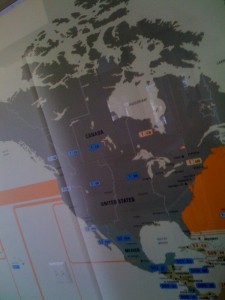 Bandwidth Lines on Paper
Though over the years this type of map has become a bit more colorful and pleasing, it hasn’t really become more informative. If you want a poster for yourself (www.teleography.com). Note that if you want some hard data to back what the map is saying up be prepared to drop $5,000 though.
Now the challenge with paper maps based upon even the most well researched data is that they don’t change easily. As infrastructure changes the map needs to be redrawn. Further they can only show a limited amount of data at once and can do nothing to address that which changes real time – enter real time visualization.
A significant concern with visualizing the Internet is the simple question of from what vantage point can you map it? Obvioulsy no single Internet provider, backbone vendor, etc. has insight into everything easily but the larger the footprint the more interesting the image, thus let’s explore one of the larger footprints online – Akamai who in fact provides a visual real-time Web monitor Here we are looking at network attacks plotted on the world map.
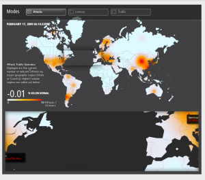 Akamai Network Attack Status
So apparently there are attacks going on in the US, eastern Europe and parts of Asia mostly. We are averaging 110 attacks for this day which apparently is just shy of normal. But what does this mean? What actually is an attack? Is it a Web application attack? If so they are off by maybe a factor of 1000-times or more. Is it some network traffic denial of service attack? is it a bot net on a rampage? No easily found data at least on the visualization reveals this.
Large visual points of interest attract the eye, but do they inform the brain? For example, what does the large red explosive dot in China mean? Is China getting malware bombed or is it dumping such garbage out, sadly the later is more likely but neither is clear. This graphic is quite pretty but frankly it doesn’t really say much that is helpful.
Now looking at traffic it is moderately more interesting.
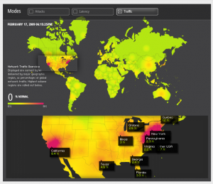 Akamai Traffic Visualization US
Southern California is clearly pushing some traffic right now. Of course this seems an interesting picture particularly if you are from the area pushing traffic, but it might be a lot more informative if it had time of day or sun indications on it.
You see there is a clear reason that Europe is low traffic right now. If you check the time here on the snapshot and adjust time zone wise it is the middle of night there. Pretty safe guess is that you wait maybe a few hours and retake the picture and presto traffic appears in Asia and west coast and is very low on the east coast. A few hours pass and yes here you have it.
 Akamai Traffic Visualization Asia
So this does tell us some things but mostly it reveals that indeed the citizens of the world sleep and they stop using the Internet at that time. Maybe if we plot Twitter traffic we might not find this truisim for a certain class of Web user, but most fall in to time tested Circadian Rhythms.
Looking further at more visualizations of Akamai we can look at real time traffic and media usage.

Here we learn that there are over 800,000 video/audio streams going on with most of it on demand, but some live streaming.
Also we see 5 million hits per second with nearly all of it from North America (again with the night time thing). What these hits are is clearly variable – a pixel.gif or huge Dreamweaver.exe downloads who knows. We also see there is nearly 60 million visitors per minute. I guess that roughly makes sense if you do some back of the envelope math. So like many Web analytics metrics we have a number big or not, but now what?
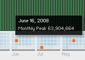
Numbers can be interesting particularly when compared to other numbers that are bigger or smaller, so let’s go back and look at the historical data to get a sense of what is going on for comparison purposes. Unfortunately here we find very little data. A roll of the orange box reveals a high/low point of the month but there isn’t much else.
So if these visualizations are a guide the Internet really does have something in common with the Matrix, you can’t really know much about or even see it, but it is in fact all around us.