
2018 Web Trends: Forecasting from 2017 Projects
Notable Changes Across the Web
Over the course of 2017, PINT’s web team engaged in several different types of projects, from website redesigns to software and file sharing integrations. In 2018, PINT plans to continue improving our clients’ businesses based on the web trend data we’ve gathered throughout the industry over the past year.
We thought it would be useful to share some of the most notable figures and findings from 2017 and to provide our thoughts on what to expect from web users (or what they might expect from you) in 2018.
PINT’s recommendations for change/implementation in 2018:
- Increase your website’s speed
- Implement security hardening measures for your CMS and website
- Focus on mobile first design
- Use videos for marketing and product descriptions
- Get rid of Flash (if you haven’t already)
- Integrate Progressive Web Application (PWA) technology
- Improve site conversions by testing and reacting to user tendencies
Improve the speed of your website across all devices
In terms of importance to users in 2018, website speed is going to fall somewhere in the range of important to imperative, especially on mobile.
According to data gathered in 2017:
- Slow-loading websites cost the U.S. e-commerce market more than $500 billion annually
- 51 percent of U.S. online shoppers state slow site loading times as the top reason they abandon a purchase
PINT understands that many websites do not contain an e-commerce element. However, if you consider user completion of a contact form as a “purchase” on your website, wouldn’t you want 51 percent more of those form submissions? If so, we recommend speeding up your website and once you’ve sped it up, speed it up some more!
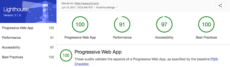
The emergence of Progressive Web App (PWA) technologies has allowed PINT’s team to drastically improve the speed of several websites. Most recently, the launch of a PWA for BePHenomenal improved the website’s load speed to under 1 second on all devices and, with the addition of a new technology called a Service Worker, even allowed users to quickly view website content on a spotty internet connection or without a connection to the internet at all!
In 2018, PINT plans to utilize PWA technologies for all new projects, and to upgrade past projects to leverage these technologies, as well.
Ensure Security of your website and CMS:
We’ve recognized that website security seems to be on the back burner for many companies. Lack of knowledge of the importance of security might play a role in this, as might some common misconceptions. One frequently-cited misconception is that implementing Secure Socket Layers (SSL/HTTPS) slows down your site’s speed and will thus negatively impact your organic search ranking. This is incorrect, in fact: Google’s search engine algorithm is now favoring sites running SSL over sites that do not provide a secure communication protocol between the user and the website server.
Your website might not transmit personal information, but the user visiting your site likely has some of their personal information stored in cookies on their browser. If your website’s connection to its users is not locked down via Secure Socket Layers (SSL), those cookies are now unprotected and are accessible to a hacker with malicious intent. You’ll also notice a nasty “not secure” warning in the URL bar on websites not running SSL. We look for the pretty green lock and notation of SECURE when we visit a site, and you should too.
Installing SSL has become one of the quickest, easiest, and cheapest ways to improve your website’s security. In 2017, PINT installed SSL for several of our clients. Some of these installations were on basic brochure websites and others were on more complex e-commerce sites.
Importance of CMS Updates & Security Hardening:
Another major vulnerability and point of attack is via your website’s Content Management System (CMS), if you choose to use one. What’s the most popular CMS on the market? You guessed it: WordPress. This CMS is leveraged by more than a third of all websites.
WordPress is open source software, meaning any user has the right to study, change, and distribute the software. Basically, anyone can download and use the tool, as well as modify it to their liking (and capability). This flexibility invests the platform with an element of instability proportionate to the skill of the development team that performs the implementation. Additionally, new versions are released pretty much every month to patch security vulnerabilities and if your team isn’t on the ball with updates your site may be dangerously exposed.
Other common, open-source CMS platforms such as Drupal and Joomla! also present similar security vulnerabilities. According to some recent research, over 75% of all legitimate websites contain un-patched vulnerabilities.

The number of hacked sites increased by 32 percent from 2015 to 2016 — and Google has publicly said it isn’t expecting this to go down anytime soon. Keeping your website’s CMS updated is crucial to ensuring the highest level of security, and preventing unwanted access to back-end data associated with your website. PINT has alerts set up through our messaging system, Slack, for the CMS platforms we leverage for our clients. This allows us to recommend these updates as soon as they are ready and stable.
Some other CMS security hardening steps you can take include:
- Platform updates when they are available
- Password resets every month
- Updating default CMS settings (change the default WP admin login URL from /wp-admin)
- Using a headless CMS or static website instead of traditional a CMS
- Site backups on a weekly basis (more if changes are made often)
- Keeping plugins updated and removing any unused plugins
Focusing on Mobile-First Design Concepts
You may have heard the term “responsive design,” a common practice for allowing a website to function nicely on a mobile device or tablet. While responsive design was a useful approach to web development during the growth of the mobile device market, many designers and developers are now moving away from this formerly-dominant paradigm. Here’s why:
In a typical responsive design approach, a graphic designer will likely begin the design process with the properly-arranged desktop version of the website. This desktop version and all of the desktop assets (images, content, etc) will then be reduced in size during site production to fit the screen of any device. When a user visits the website, these assets are all sent in a set to the user’s device, and the site’s code will respond to the screen size, selecting the appropriate assets (hence, “responsive” design).
This transfer of assets is bandwidth- and computation-heavy and while you may not notice it on your powerful desktop or laptop, your mobile device surely will. Rather than loading this same large set of assets on a mobile device (which has far less bandwidth and RAM than a desktop computer), the proper approach is to allow an entirely different set of “device specific assets” to load.
This concept is known as mobile-first design, focusing on building the site to perform for a mobile device, and then expanding the site’s functionality and asset library as allowed by the device being used to visit the site. With the majority of web traffic now occurring on mobile devices, shouldn’t your users have a first-rate mobile experience?
Some notable figures regarding the dominance of mobile usage on the internet in 2017:
- 83% of mobile users say that a seamless experience across all devices is very important1
- Mobile devices will drive 80% of global internet usage by 20188
- 69% of consumers worldwide between the ages of 18 and 39 use mobile devices to research products before they buy3
- 57% of users say they won’t recommend a business with a poorly-designed mobile site.3
- 91% of mobile users say that access to content is very important1
- Google says 61% of users are unlikely to return to a mobile site they had trouble accessing and 40% visit a competitor’s site instead1
- In 2017, mobile devices account for 61.9% of Google’s paid-search clicks – up from 53% in 2016.3
E-commerce expectations & site conversion improvement
With major outfits like Amazon and Alibaba leading the way, it’s no wonder the B2C e-commerce industry is estimated to reach $2.35 trillion by 2018. These mega-online-retailers have set the standard for a user’s expectations of a website’s speed, capability, and functionality. This doesn’t only apply to online retail, but to pretty much all online activity, whether that be scrolling through your social media feed or scanning the latest email from your favorite retailer.
In a study from 2017, more than half of U.S. online shoppers cite slow site loading times as the top reason they abandon a purchase, and slow loading websites cost the U.S. e-commerce market more than $500 billion annually. Increasing your site’s load time from 8 to 2 seconds can boost your conversion rate by 74% (this is based on data monitoring real user activity from 33 major retailers).
PINT completed the redesign of a couple of e-commerce websites in 2017 including, most recently, the completion of a Magento 2 build for an online education institution. The school offers courses and course bundles via their website and saw a 15-20% boost in enrollment after the launch of the new website, which included a modern design and an audit/revamp of the website’s existing SEO and SEM campaigns.
Of course, there are other ways to improve your e-commerce conversions:
- Use push notifications on your website to announce a new product offering
- Email campaigns to pull users to the site and specific products
- Add videos to product descriptions
- A/B test your website
- Analyze site activity with in-depth monitoring tools like FullStory to detect and react to site errors and user behavior
How should you prepare your website for 2018?
You aren’t alone if you think your website needs some work. Browser updates and changes in web tech and user expectations create a constant flow of reactive updates. There are some web initiatives, though, that shouldn’t be left on the backburner.
Website security is probably the most important factor going into 2018. Protection of visitor information via the installation of Secure Socket Layers (SSL) to your website, and locking down your systems with security hardening should be first on the list.
Website speed improvements will also be of primary importance in 2018. Speeding up web page load time, even if it is only by a second or two, should be a high priority. You can use tools like Lighthouse and Google Page Speed Insights to locate low hanging fruit for speed improvements.
You might be planning a redesign of your website in 2018. If that’s the case, you’ll want to learn as much as you can from your current website. Executing website testing and implementing user monitoring software to learn how visitors interact with your current website should be step one in any website redesign.
Of course, PINT is here to help. We are happy to provide a complimentary site audit. This audit can include a technical component to locate speed improvements as well as an audit of how users might be interacting with your website.
Sources
- https://www.impactbnd.com/blog/mobile-marketing-statistics
- http://www.ironpaper.com/webintel/articles/web-design-statistics-2017/
- https://clockwise.software/blog/web-development-trends-in-2018/
- https://thenextweb.com/contributors/2017/12/01/13-tech-trends-shaped-2017-new-predictions-2018/
- https://www.npgroup.net/blog/how-to-improve-your-cms-security-in-2017/
- https://www.valuecoders.com/blog/technology-and-apps/top-web-application-development-trend-in-2018/
- https://www.zenithmedia.com/mobile-forecasts-75-internet-use-will-mobile-2017/