Expanding Content & Improving UX for the Immunotherapy Foundation
Project Summary
The Immunotherapy Foundation (IF) came to PINT seeking a revamp of their existing single page WordPress website. The main goals were to expand upon the website’s content, engage visitors, and improve the user experience for supporting IF in the donation process.
After some stakeholder interviews, PINT’s information architecture team went to work wireframing a layout for the website’s expanded content, while our design team incorporated existing brand guidelines into a more modern look and feel including a “patient resources” page. This new section of The Immunotherapy Foundation website allows users to learn more about different types of cancers by interacting with these cancers where they originate in the human body.
Client Overview
Immunotherapy Foundation (IF) is dedicated to eradicating HPV-related cancers by catalyzing immunotherapy research and advancing the HPV vaccine as a critical cancer-prevention tool. IF strategically supports the most promising cancer immunotherapy research for HPV-driven cancers and works to advance educational programming and advocacy for the HPV vaccine.
Through collaborative partnerships, IF is working to accelerate and amplify initiatives and to build out regional, national, and international efforts to reduce the incidence of HPV-related cancers.
Client: The Immunotherapy Foundation
Location: San Diego, CA
Industry: Immunotherapy Research
PINT Services: UX/UI, Information architecture, design, development, quality assurance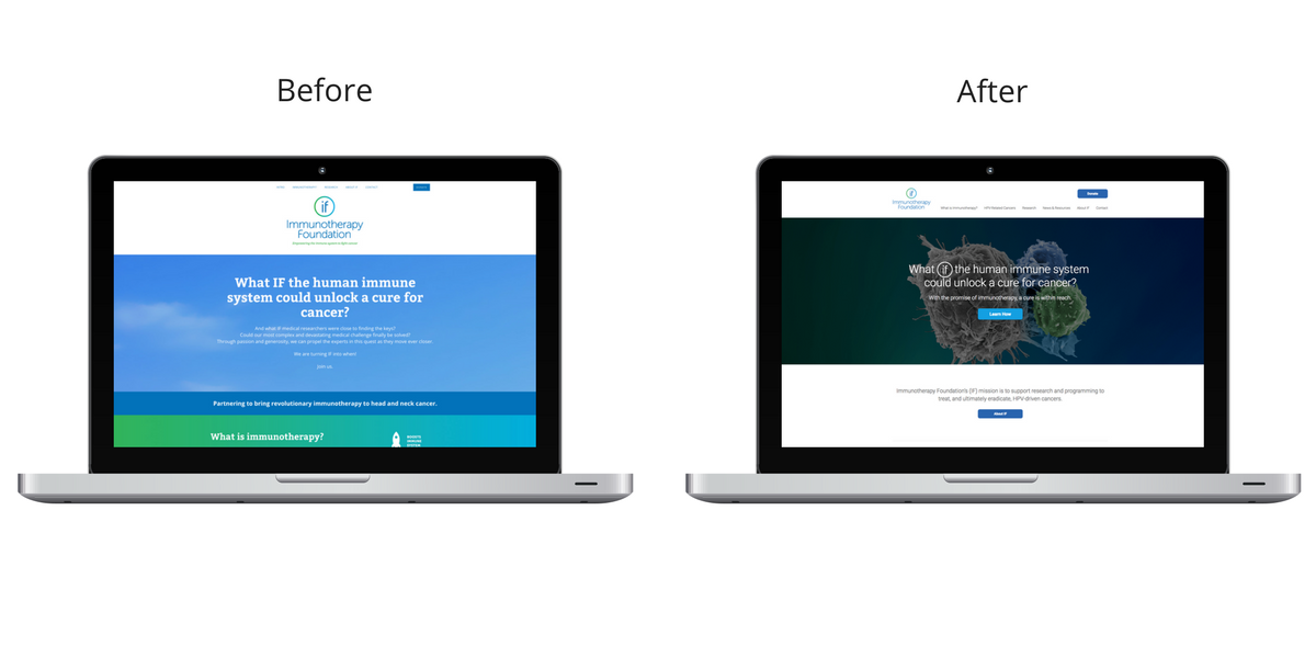
Challenge
Content infrastructure and user experience were the main challenges faced by The Immunotherapy Foundation before the project. The initial website design was built in the organization’s nascent stages and had limited expansion capabilities. As such, IF was confined to a single page WordPress template. This template did not provide the IF team with many options for page addition or layered navigation.
The “donate” flow felt disjointed as it removed the user from the IF website to a non-branded page that did not appear to be connected to The Immunotherapy Foundation. We wanted to improve the user experience on the “donate” page, giving visitors an opportunity to better engage with the IF story and support their work.
Solution
Content Infrastructure & Modern Design:
The IF team is striving to provide a digital information hub for people wanting to learn more about immunotherapy research and HPV related cancers. To ensure this additional content is presented in a way that makes sense to users, PINT’s Information Architect worked with key members of the IF team to outline these new pages and the content that might live within each section. This new content layout was presented to the IF team through a wireframe: an image or set of images which displays the functional elements of a webpage.
Once the wireframes were approved, PINT’s design team got to work incorporating the brand guidelines that were provided by the IF team. Although the logo and branding remained consistent between the old site and the new site, PINT’s design team made a point of including modern design trends, like the large hero image and the circle within the IF logo in different areas of the website.
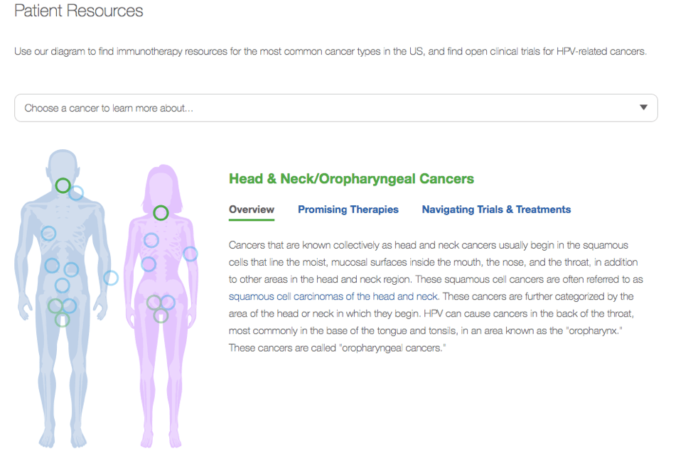
Patient Resources Diagram:
Part of the project was a “patient resources diagram” that provides a place where visitors can engage with the human body in an effort to learn more about cancer associated with those specific areas. This was part of the desire to expand the content on the website, as well as to improve the user experience and interactivity. This also achieved a key piece of IF’s mission to support patients in better understanding the diseases they are living with and new, alternative therapeutic options as they are tested and developed.
Improving user experience for “donate” section:
During our initial conversation regarding the web project, PINT made it clear to The Immunotherapy Foundation that the setup of the existing “donate” section was quite jarring for the user. Originally, the “donate” button on the website brought visitors directly to the page shown below, which has no IF branding.
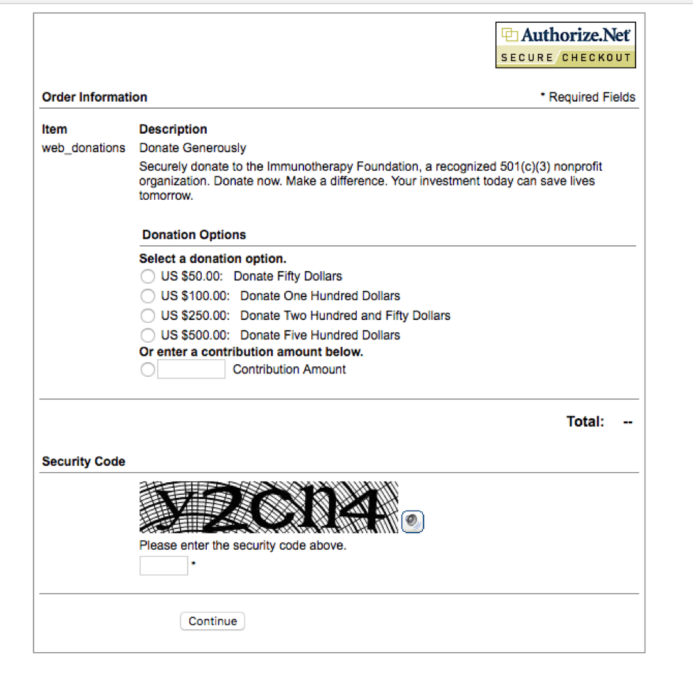
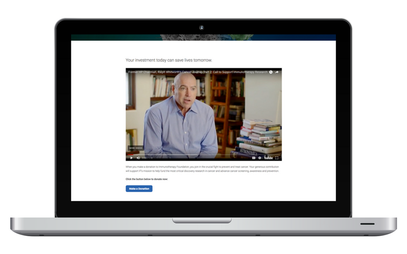
We are still working with IF to update this page, but in the meantime we eased the user flow a bit by providing a step before sending the user to the donate page. The additional step takes the user to a page with the video of the IF story, helping to provide more information about WHY the person should donate, and a special message on the importance of giving from their late co-founder, in his own words.
Results
The web project has provided the Immunotherapy Foundation with a new website structure and style to accommodate more content,a more appealing visual design, and the ability to relay the full impact of its programs and history.
The expansion of content included the integration of an interactive “patient resources diagram” page as well as a section specific to HPV related cancers. Completion of the project also improved the user experience of the website, giving greater emotional impact to the “donate” section and leaving site visitors with a sense of IF’s vision for the future.
Since launching, IF tells us they have received consistently positive feedback from friends and new visitors alike, not only on the look and feel of the web design, but the resources provided to educate visitors on these critical healthcare issues.
PINT works with many non-profit organizations to help improve their web presence, and ability to leverage technology to strengthen business logistics. Please reach out to the PINT team to learn more about how we can help your business.