
Active Motif: How to Increase Ecommerce Conversions with Mobile Optimization
Project Summary
For a life science company specializing in epigenetics assays and services, organic search traffic is vital to the eCommerce side of its business. To ensure the Active Motif site was optimized for Google’s mobile-first indexing push, we implemented responsive web design and optimized website speed with the help of Chrome DevTools.
As a result, Active Motif’s mobile conversion rates increased by 27% and tablet conversion rates by 34%.
In addition, Active Motif’s Google Lighthouse performance score increased by 343% overall. First Meaningful Paint improved by 75% and Time to Interactive improved by 51%. Lastly, Active Motif’s Google Lighthouse SEO score increased by 84%.
Client Overview
Active Motif is an industry leader in the epigenetics research tools space, headquartered in Carlsbad, CA. Active Motif’s assays, proteins and antibodies help researchers investigate nuclear function with an emphasis on chromatin dynamics.
In addition, Active Motif provides end-to-end epigenetic services including services for ChIP-Seq, DNA methylation, and transcriptional regulation.
Client: Active Motif
Location: Carlsbad, CA
Industry: Epigenetics and Biotechnology
PINT Services: Information Architecture, UX Design, Web Development
Technology: Symfony, PHP, JavaScript, HTML/CSS
Challenge
Over the past decade, mobile web traffic has increased significantly as a percentage of all device web traffic (desktop, tablet, and mobile). As a result, Google has moved towards mobile-first indexing.
In order to help its ecommerce site stay relevant to Google and rank strongly against the competition, mobile optimization was necessary. Preserving the current organic rankings and making it easier for mobile users to purchase products were two of Active Motif’s strategic objectives to grow revenue from organic search traffic.
Active Motif’s site at the start of this project was not responsive for mobile devices. In addition, the way the Active Motif site was built in a custom framework made it challenging to make responsive template updates. Most of the site pages were hard coded within each CMS page, resulting in few global places to make necessary adjustments.
The structure of its current design implementation resulted in a lot of manual work that had to occur on a single page basis. Lastly, most of the design elements on pages had text within images, so when scaled down on mobile, the font would be too small to read. A major overhaul of images used throughout the site had to occur as well.
Solution
PINT consulted with Active Motif on responsive web design and optimized website speed. To aid in optimizing Active Motif’s website speed, we used Google Chrome’s DevTools and Google’s free Lighthouse tool to test website speed and performance.
During this engagement, we were able to optimize speed through implementing HTTP2, lazy loading images, and eliminating render blocking resources.
Responsive Web Design
To implement responsive web design for the Active Motif website, we used the meta name="viewport" tag to dictate to the browser how content should be adjusted. The meta name="viewport" tag instructs your browser on how to adjust and scale the page in relation to the width of the device.
It is important to note that when implementing meta viewports you should not use large fixed width elements, rely on a specific viewport width to render, or use CSS media queries to style different screen sizes as that requires setting four different attributes (initial-scale, minimum-scale, maximum-scale, and user-scalable).
Instead of using a large fixed width, you can use relative width values, such as width: 100%. Once rendered, use CSS media queries for responsiveness: min-width, max-width, min-height, and max-height. We recommend using min-width over min-device-width as min-width is based on the size of a browser vs. the size of the screen.
Most Common Screen Resolutions via statcounter
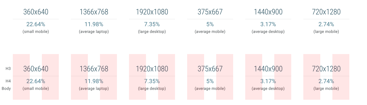
We adjusted the font and image sizes as the viewport shrunk so that the layout of the page would show the optimal amount of content. Since mobile screens are much smaller, they increase the cognitive load required of users: The interaction cost to achieve user goals is higher on mobile, and users have to rely more on their short-term memory because less information is visible on the screen. Reducing content on mobile can be especially challenging for a relatively complex site like Active Motif’s, which makes it all the more critical for a good user experience.
One way that our team addressed this challenge was by implementing an interaction design technique known as progressive disclosure, where data is made visible only as users request or need it.
In the examples below, a simple table was adjusted to be hidden by default, and only appear upon the selection of a button. As a result, the mobile content took up less space on the initial load, allowing users to see more of the screen and orient themselves to the page more easily before deciding whether to expand the table.
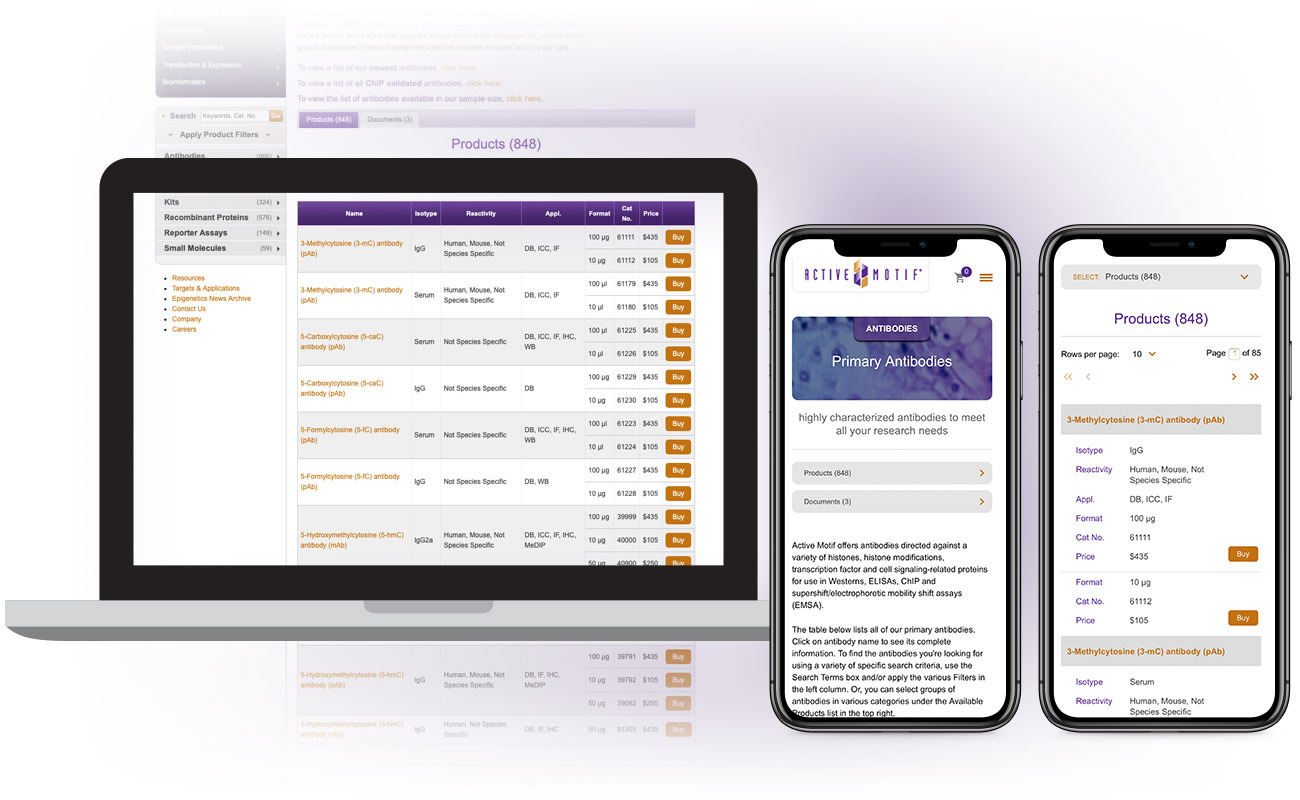
The use of progressive disclosure helps to reduce users’ cognitive load and aids in their comprehension of an interface.
In order to fully control what content is being manipulated on different viewports, we created page specific class names.
Example: <body class=”body-name”> and <div class=”page page-name”>
Performance Optimization
To improve Active Motif’s website speed, we implemented HTTP2, lazy loaded images, and eliminated render blocking resources.
HTTP/2
The prior Active Motif website was using HTTP/1.1 and no HTTPS or Keep-Alive. As a result, there were a lot of small images and scripts that had to be loaded via separate HTTP connections.
Using HTTPS allowed us to use HTTP/2. HTTP/2 solved many performance issues right away with no coding changes (only minor configuration changes).
When your website has a lot of small files such as images, scripts, and CSS, HTTP/2 is optimal. HTTP/2 improves performance through more efficient use of network requests, in addition to the use of a header field compression to allow for multiple concurrent exchanges on the same connection. Previous HTTP/1.x protocol does not compress request and response headers, causing unnecessary network traffic and inefficient resource prioritization.
To sum up, the major gap between HTTP/1.x and HTTP/2 is a much better use of the underlying Transmission Control Protocol (TCP) connection.
Lazy-Loading
Lazy-Loading is essentially deferring offscreen and hidden images after all critical resources have finished loading to lower the time to interactive. PINT implemented lazy-loading by using src attributes within <img> elements in the HTML of the page.
We use JavaScript to check if the images are within the viewport or screen size of the end user. If the image is within the viewport of the device visiting the page, we load the image content right away. However, if the images are outside of the viewport of the device, then the images are not loaded right away.
Example Implementation:
<script type="text/javascript" src="/js/lazyload.min.js"></script>
<script>jQuery("img[data-src]").lazyload();</script>
<img data-src="/uploads/images/homebanner/home-hero-p300.png">
Eliminate Render Blocking Resources
The prior Active Motif website had the “scripts” section at the top of the page within its HTML code. This forces the browser to load all of the scripts before displaying the page.
Moving the scripts to the bottom of the page can immediately improve the user experience, perceived load time, and overall perceived website speed.
Any resource that blocks the first paint of a web page is considered a render-blocking resource. To eliminate render-blocking resources, it is important to consider deferring all noncritical JavaScript and styles to the bottom of the page.
In general, CSS is usually treated as a render-blocking resource. To combat this, you can use media types and queries to mark some CSS resources as non-render blocking.
Example Implementation:
<link rel="stylesheet" type="text/css" media="all" href="/css/blueprint/screen.css" />
<link rel="stylesheet" type="text/css" media="screen"
<link rel="stylesheet" type="text/css" media="print" href="/css/print.css" />
<link rel="stylesheet" type="text/css" media="all" href="/css/jquery-ui.css"/>
<link rel="stylesheet" type="text/css" media="screen" href="/css/jqModal.css"/>
<link rel="stylesheet" type="text/css" media="all" href="/css/style.css?1557177450" />
Documentation
At the end of the project, one of the measurements of success that we consider at PINT is the maintainability of the code we write. To wrap up this project, we created a Style Guide for the new JavaScript framework.
We created the Style Guide within the CMS that contained all examples of new CSS features. The benefit of providing documentation within a CMS is that you can provide full code examples in a convenient location, as well as show examples of the end results. In addition, the JavaScript page shows reusable features and how to create new scripts to utilize or work with existing ones.
Results
The solutions PINT implemented for Active Motif significantly improved overall load times, which as a result has improved Active Motif’s organic rankings by 17%. In addition, Active Motif’s average position on mobile according to Google Search Console has increased by 16% and mobile sessions are up by 6%.
The load experience for end users has drastically improved. According to Google Lighthouse, Active Motif’s performance score improved by 343%.
The areas for performance improvement for Active Motif were ‘First Meaningful Paint’ and ‘Time to Interactive. First meaningful paint is the time it takes for a page’s primary content to appear, and is important to ensure the perceived performance to the end-user isn’t poor. Time to interactive (TTI) metric is the time it takes for a page to paint, register most visible event handlers, and respond to user interactions. A poor TTI can be detrimental to the end-user’s load experience and performance perception, causing them to bounce.
Before
Active Motif had a performance score of 16 on Lighthouse. The performance score consisted of a 6.85 second ‘First Meaningful Paint’ and 11.64 second ‘Time to Interactive.’
The site had an SEO score of 60 on Lighthouse.
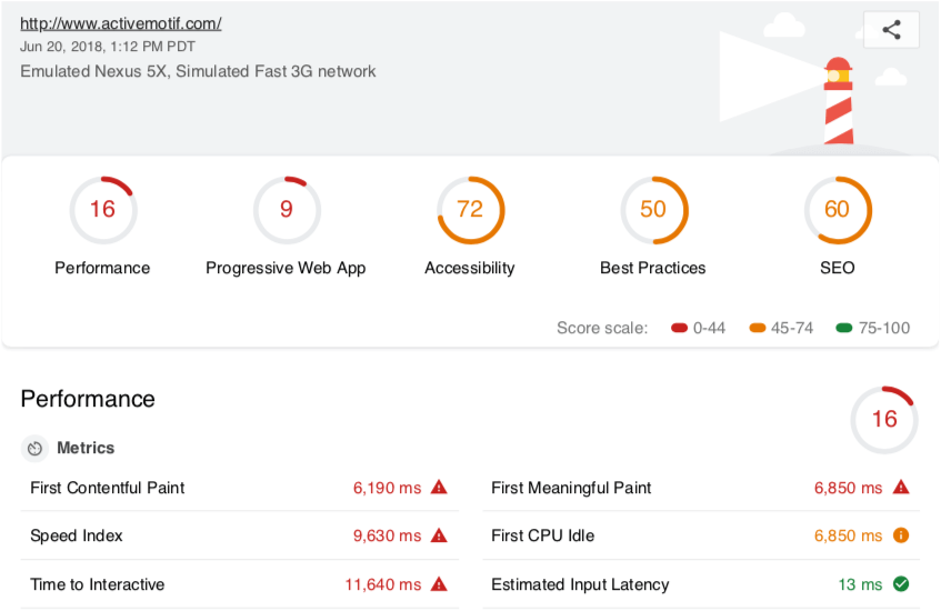
In addition, Active Motif had a goal conversion rate of 1.65% on mobile according to Google Analytics.
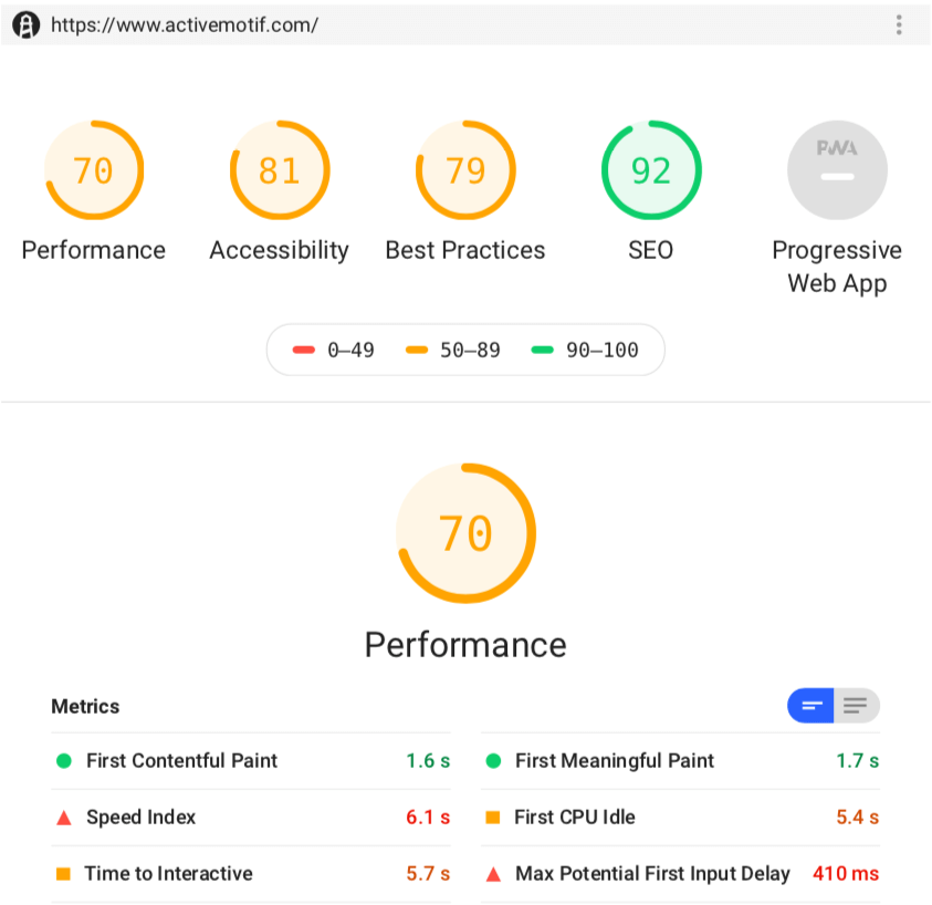
After
All of the Lighthouse metrics improved significantly. The performance score increased by 343% from a score of 16 to 71. First Meaningful Paint improved by 75% (from 6.85 s to 1.7 s). Time to Interactive improved by 51% (from 11.64 s to 5.7 s).
In addition, the SEO score increased by 84% from a score of 60 to 92.
Active Motif experienced a 27% increase in their mobile goal conversion rates (from 1.65% to 2.10%).
Interested in optimizing your website for SEO or mobile responsiveness? Reach out to us for a consultation.