
Lessons Learned While Making an iPhone Web Site
I am pleased to announce PINT has recently launched a version of our corporate web site custom tailored to the iPhone. Having watched this project play out from it’s inception, I can attest to the differences encountered when developing specifically for iPhone Safari, as opposed to coding in support of more traditional (although often quirkier) browsers.
Designing for mobile aside, I will discuss the lessons learned from developing a minified version of a corporate web site for the iPhone. We wanted to include as many features as possible, to showcase the iPhone’s wide range of features available to Safari. What we discovered, however, is that it doesn’t offer several basic things that would be valuable to a corporate entity such as an ‘Add to Contacts’ option (perhaps available via hcard or vcard microformat?), ‘Download to calendar’ option (We can’t get some iCal love?), and easily findable documentation – hint: make sure you register at the Apple site. Below you will find some of the things that made developing a miniature version of our company site for the iPhone a challenge.
1. Animation – Leave it up to the browser
Webkit Transitions / Webkit Animation
When looking to do animation on the iPhone, CSS webkit transitions are the smoothest, if you can get them to work. There are many quirks in the implementation that make this method more difficult than expected, and there is a lack of documentation. We had trouble animating the height and opacity attribute, so in the interest of time, we moved on to something more familiar. We also were unsure how to simulate ‘before’ and ‘after’ handlers within the animation timeline, so we left those to JavaScript for now.
YUI Animation
We used YUI as our JavaScript library and for our animations. YUI was the best fit as a JavaScript library for several reasons:
- It is the library PINT has chosen for regular web site projects, so our developers are all familiar with it.
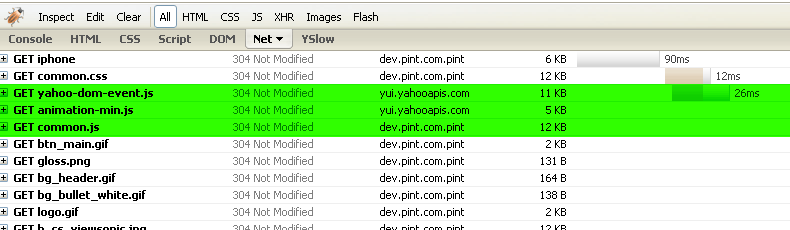
- When served by Yahoo!, the minified files are under 25KB and on a CDN, so they load quickly and get cached on the iPhone (See screenshots below). Souder’s rules suggest bundling objects for improved load time, but in this case we’ll take the cache benefit over a few less HTTP requests.
Files under 25KB get cached
When each file is served by YUI, the files are cached and loaded quite fast because on a CDN.
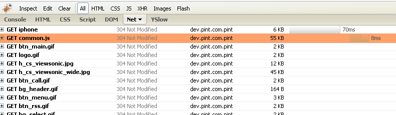
Files over 25KB do not get cached
When files are consolidated, filesize may become too large.
3. We were able to use existing in-house widgets to quickly create effects.
IUI Library
IUI Library is a well written library by Joe Hewitt that has built-in support for most of the UI effects one would want to do with a web app on the iPhone. Although we used some of Joe’s code in our own implementation, we still probably could have saved time and smoothness by starting out with IUI rather than mixing and matching YUI as we did.
2. Gestures / Touch Events – Take Advantage
Apple has given the iPhone Safari some new events to handle touches and gestures.
We used the touch events and their clientY values to determine if you slid your finger from the left to the right or vice versa. By doing some digging around, we found Matthew Congrove’s flick code. With a little work, we were able to get that talking with Joe Hewitt’s animation code, which allowed our menus to use the same slide code as our galleries. In the next version of our site, we’ll convert all javascript animations to webkit transitions and/or animations.
One problem we had with Matthew’s code is that up/down scrolling functionality is lost with his small example there, but it can be easily added back in with some clientX before and after comparisons.
3. Orientation – Let CSS do the work, not JavaScript
The iPhone supports two orientation modes: portrait and landscape. Some authors have recommended devising show/hide functionality to hide entire sections from one orientation or the other. What we noticed in our designs, however, is that our pages look pretty similar in both modes with the exception of images, which often become wider when in landscape mode. We decided to make the layout a flexible width of 100% with CSS, that way the page content looks and feels like it should at any orientation. To hide anything that shouldn’t be visible for that current orientation, we introduced an orient attribute to the body tag, updated that value when the ‘onorientationchange’ event was fired, and used a CSS selector to hide the content.
 |  |
One of the things we noticed when switching across orientations was that common left/right slider mechanisms had adverse effects on portrait mode when coming from landscape mode. Some more prodding is needed here, but just be sure to check any pages that use relative or absolute positioning for slide effects in both orientations (if you are supporting both).
All troubles aside, it was a pleasure developing solely for Safari on the iPhone and I wish every project could be as creatively groundbreaking as this one. And boy was it good to drop IE6 support for once.
In case you don’t have an iPhone, here is a slideshow of some of the pages from the site:


Ultimate Lesson: iPhone Safari is Safari, but web site development for iPhone is different. Don’t do as normal web developers do.