
Mobile-First Design: Optimizing Your Website’s Performance
In October of 2016 mobile internet usage surpassed desktop usage, and this trend is continuing to climb. In order to ensure an ideal performance on any device, many web designers have shifted to a “mobile-first design” concept using progressive enhancement. This article will dig into the what, why, and how of this approach.
What is Mobile-First Design & Progressive Enhancement?
Mobile-first website design is the concept that mobile design is the hardest, and should be done first. This strategy focuses on designing for the smallest screen size and slowest browser first then working your way up from there.
Expanding upon the application’s features as device speed, size, and power increase, is known as progressive enhancement. Mobile-first design provides the foundation for leveraging progressive enhancement.1
Starting with the product’s mobile design first allows us to consider restrictions like bandwidth, screen size, and operating power (RAM). Squeezing desktop-sized assets (images, content, etc.) onto a mobile device screen can prove to be difficult. This approach also forces the prioritization of the most important product features.
Basically, we are designing the application to deliver the correct user experience to the right device.1
Why should we leverage mobile-first and progressive enhancement in web design?
There are a few reasons, all of which stem from a central theme: the overall increase in internet traffic via mobile devices and tablets. As mentioned above, in 2016 internet usage worldwide via mobile devices and tablets surpassed desktop usage. On top of that, people are spending more time on the internet via mobile endpoints and smartphone sales have long since eclipsed those of desktop. More people are using mobile devices to search the web, so your website should work really, really well on a mobile phone.2
There are also other factors to consider, like the explosive growth of mobile web in the markets of India, Asia as a whole, Africa and Latin America. Users in less-developed portions of these regions may experience poor connections, and may have slower devices than users in highly-developed regions. A lean application is needed to ensure a decent experience in these environments.
How to leverage mobile-first design & progressive enhancement?
Mobile-first design translates to content-first design. After all, content is the reason people are visiting your website. A mobile device will be limited in terms of speed, screen size, and power, so designing within these parameters forces you to prioritize content carefully.3
Here are a few things to consider when approaching a project using a mobile first design concept:3
Inventory of content: This will map out all of the content for the application, and might be presented in the form of a site structure/site map.
Prioritize content for visual hierarchy: You’ll want the most important content front and center on any device, so determining the visual hierarchy of content per device is important.
User research will be very important here, understanding not only what you as a business want people to do, but also what factors compel users to convert (e.g., product details, pricing, details about your company), and the priority order relative to their values. You might consider outlining what devices are being used to access your website (something you can determine through Google Analytics).
Increase touch points for CTAs: You’ll want to make sure the touch elements on the website are large enough so a person is able to easily click. Remember, a mouse cursor is much more accurate than a finger.
Leverage device-specific images: Loading a large image file onto a mobile phone is costly in terms of page load. On a 3G connection it takes about 5 seconds to download one megabyte. It’s recorded that about 40% of people abandon a website that takes more than 3 seconds to load4.
If you’re able to optimize image sizes per device, you can shave a few hundred milliseconds off page load time, and increase your conversions.
Test! And test some more! Find an old device that is running a 3G or slower connection, and use it to view your website. You may need to tether the device to your computer (to access the web) via a USB cable. Peel through the website, ensure that the proper content loaded first, and you’re able to navigate the pages smoothly.
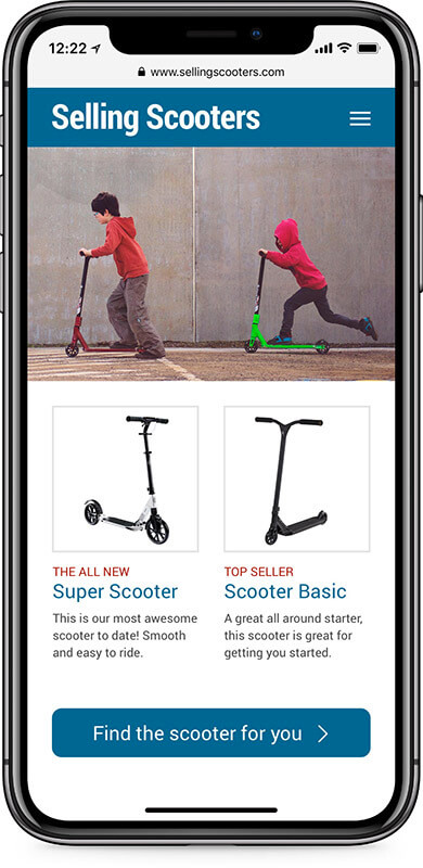
Here’s an example of what a new application content prioritization might be for selling scooters:3
- Newest scooter available
- Top-selling scooter
- Find the scooter for you
- Company name and branding
- Navigation
- Search
- Testimonial
- Second best seller
- Latest blog post
To keep things simple, let’s consider items 1-3 as high priority, 4-6 as medium priority, and 7-9 as lowest priority for the application. With this in mind, we’ll start our mobile first design by wireframing for smartphones (smallest and slowest devices), and focus on incorporating these three high priority features into that wireframe, this might look something like this:
Once we have buy-in on the mobile first design foundation, we can begin expanding its features onto other devices, like tablets, which might include items 1-6 on the above list.
The last step would be to design for a desktop computer. In this wireframe, we’ll incorporate items 1-9. We’ll also have the option in this phase to incorporate more advanced design elements such as hover effects, larger imagery, and interactivity.
The progressive introduction to content might look something like this:
In conclusion
With the increase of mobile traffic on the web and expansion of web use throughout the world, mobile-first design and progressive enhancement will become more prevalent. The use of device-specific features and content will help ensure your website’s users are getting the most important information up front, no matter what device they are using. Reducing the use of large assets and design heavy elements on slower devices will improve page speed, and increase conversions.
Starting a new web design project? PINT is happy to offer feedback or guidance. Tell us about your project through the form below.
SOURCES