
OXXO Site Redesign: Usability for Everyone
OXXO came to PINT, Inc. to redesign their website. As a convenience store chain with more than 11,000 locations in Mexico, they are a very recognizable presence in the region. But beyond branding concerns, a website redesign would also have to address:
- A wide offering of products and services available at OXXO stores
- Numerous corporate initiatives supported by OXXO management
- The diversity among audience groups visiting the site
These issues may seem like a tall order to address in one unified website. The challenge was heightened a bit by OXXO’s large pool of repeat site visitors: dramatic updates to navigation and page layouts might confuse returning visitors accustomed to the existing design. But PINT leveraged a CMS update, extensive information architecture consulting, and some savvy design and implementation to create a new http://www.oxxo.com that is easy to use, both for internal users as well as new and returning external site visitors.
Although their online presence was evolving, OXXO’s site needed to keep pace. It had been several years since their last redesign. New requirements from the organization as well as user expectations had to be incorporated into the new site.
Website Redesign Must-Haves
Accommodates a Wide Audience
The site receives visits from a wide array of users. The new site as seen below on the right had to accommodate users of different ages and different levels of technical expertise.
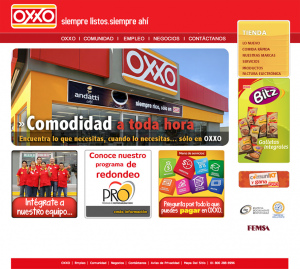

OXXO has many topics to organize in the navigation and so many items to call out on the homepage and other pages. PINT’s information architect developed a site structure that made it clear how to navigate to a specific area, but also accommodates future growth in pages and topics.
Makes it Easy to Find and Understand OXXO’s Diverse Offerings
OXXO has developed a diverse set of customer offerings, all of which needed to be easy to explore on the site. The categories include:
- Prepared foods
- Fountain and cafe drinks
- Retail snacks
- Alcohol
- Assorted retail products, some of which are exclusive brands
- Bill-pay services for mobile phones, bank cards, electricity, cable, bus transportation, and more.
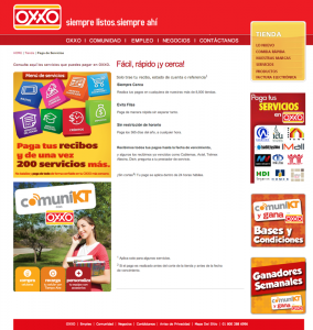
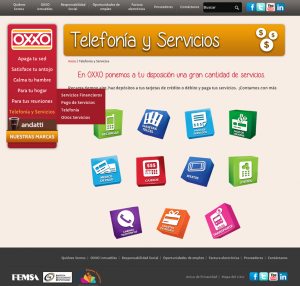
The improved navigation addressed this must-have in part. Additionally, page layouts are architected in a way that directs users’ attention to key links, but also allows them to hone in on specific details (as seen above on the right).
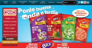
The search box improves usability for site visitors looking for a specific keyword or phrase. This feature is often the most-used element of a site, and can provide valuable insight into the content users want to find most quickly, or which pages are hard to find through the site navigation.
Allows OXXO to Clearly Display Corporate Initiatives
Social responsibility is a major value at OXXO. They participate in a variety of programs for bettering public health, the environment, and employment opportunities, just to name a few. The new site needed to make these initiatives easier to explore. It also had to make it easier for OXXO staff to add content to these pages, including photo galleries and videos, as seen below on the right.
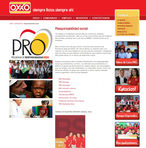
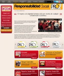
PINT considered many content management systems (CMSs) in relation to OXXO’s site needs. The resulting recommendation was that OXXO continue using our proprietary content management system (CMS), called PWP. This decision was driven by PINT’s typical considerations, as well as the way PWP allows OXXO’s unique branding to be implemented in page templates. It is also flexible enough to give staff the ability to edit several callout areas on the homepage and subpages.
Links to OXXO’s Social Media Activities
Part of the online ecosystem OXXO had cultivated since their last website update was a presence on a few different social networks. Staff wanted to the new site to emphasize these efforts.

Including social icons at the top right and bottom of every page maximizes OXXO’s outreach and marketing efforts on those channels by promoting them more than if they were placed solely in the footer.
Adheres to Government Requirements
Mexican law has established food labeling requirements. Under NOM-051-SCFI/SSAI-2010, the OXXO website must include nutritional information in specific areas. So drink details for the Andatti coffee line must include these details.
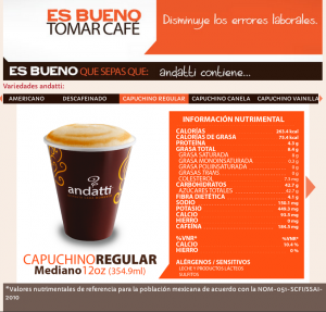
The Andatti widget is a fun way to showcase the prepared coffee drinks available at OXXO, with required nutritional facts. It is also a great way for fans of the brand to discover other products in the line.
PINT’s Redesigned Site Delivers Results
Analytics
When comparing the month since the redesign with the same period last year, analytics show positive results across the board.
In addition, the bounce rate and average visit durations on the site are down slightly, which indicates people are finding what they are looking for more easily. Site visit durations also increased slightly, which could be attributed to several factors related to the redesign, including:
- Enhanced content
- Improved navigation
- Design appeal
Another Satisfied Client
“PINT’s web design experience and process worked well to make our project efficient and successful,” said Pamela Rincon Treviño, Social Media Strategist at OXXO.
Conclusion
PINT rebuilt OXXO’s site with business-critical functionality and better usability in mind. Through research and strategy, PINT was able to build a site that addressed the client’s budget and priorities in a way that is modern and utilizes best practices.