
The Elements of Style for Website Design
A website’s design might seem like an afterthought – the proverbial frosting on the cake – but there are important usability factors imbedded in a website’s design and style. A great example of this is a recently completed project for PINT’s long-term client, the Kyocera Corporation.
 For many years, Kyocera developed their Americas site with different teams, gradually accumulating different styles and content layouts. This patchwork development eventually reached critical mass as a massive static website that required:
- An inordinate amount of time for new employees to become familiar with the structure and organization of content site-wide
- Significant resources and costs to update the website at any level, whether it was a design change to an entire section of the site, or a relatively simple request to tweak content on an individual page
- Website users to constantly adjust to different placements of core navigational tools as they moved from section to section – making their experience fragmented, disparate, and filled with unnecessary obstacles
Luckily, the internal Kyocera teams united to address these issues.

With PINT’s help, they began to update the system and unify the styling on their website, which was almost on the verge of becoming a monstrous franken-site.
Planning the Website Design
 The initial concept for the project was a simple “re-skin” and migration into PINT’s content management system (CMS). As an overall directive, this seems simple enough. But as the PINT team began cataloging the site structure, it became clear that was only the beginning.
With the massive amount of content being migrated into the new CMS – around two hundred pages of content by hand and over a thousand press releases via a custom script – the project quickly became an excellent exercise in categorization. Each element of the content, from meta data to body content to PDFs and imagery, needed to be tracked and verified as complete for production to ensure the entire website was properly transferred into the CMS.
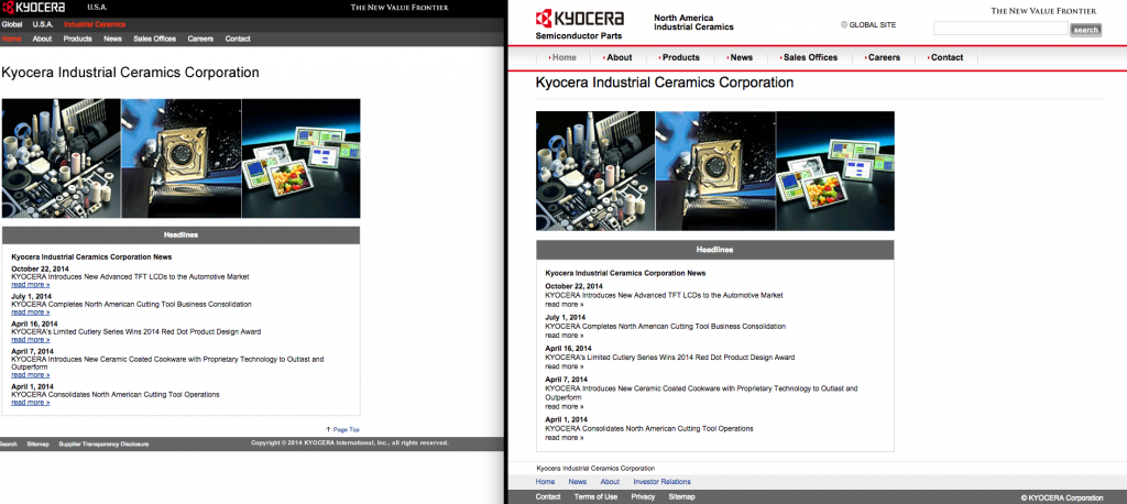
In addition, seventeen contact forms were distributed throughout the site, each with different contact information being displayed, different fields for user input, and different email address destinations for submittal. On top of that, two internal websites dedicated to specific Kyocera branches were embedded within the main website, each with their own site structures and unique navigations. All of these elements needed to be identified and tagged for the specialized engineering work required to “re-skin” their designs and rebuild the contact forms.
Being Organized Has Some Benefits
 By taking the time to perform these classification tasks before the technical development took place, the production time was dramatically lowered, helping ensure the project was delivered within the estimated timeline and budget.
To get a grasp on the content, a massive spreadsheet was generated, detailing all of the pages being migrated and tagged with the proper sub-site identification. By doing so, production and management had a solid checklist to work off of and verify that every element of every page was transferred.
All of the contact forms were cataloged by hand as well, which gave production the opportunity to merge similar contact forms into one. Although the original website had 17 different contact forms, it soon became clear that there were only four variants production needed to build, saving the production department a tremendous amount of time and effort.
These efforts also helped the client post-launch in many ways:
- Categorizing the content helped to plan for future additions of content without major restructuring.
- Properly migrating all of the content into the CMS allowed the Kyocera team to be more nimble and update content quickly, saving them time and money.
- The updated style unified the content and helped solidify the Kyocera Americas branding site-wide.
Results of a Website Design Project
Previously, navigating to some interior pages from the homepage could have confused users by their divergent look and feel.
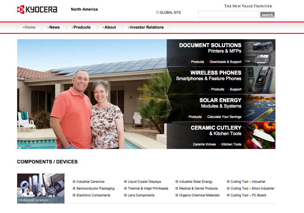
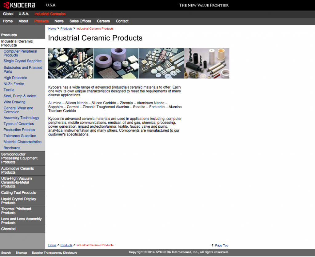
Now, they share a single style and each page type has a specific template to use to keep things in order in the future.
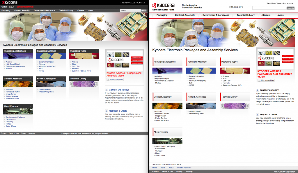
Adding content through the CMS rather than via static pages will also help keep the branded themes intact.
Solving Problems with Comprehensive Solutions
 Antiquated hardware and software approaching the end of its support window was a driving factor for Kyocera in timing their project. They were facing compatibility issues and security threats in the near future.
The easiest band-aid would have been to simply upgrade the software licenses and replace the hardware supporting the Kyocera infrastructure. However, after collaborative meetings and a needs assessment between the PINT and Kyocera teams, the most scalable and secure solution over the long-term proved to be a new technology stack and a new CMS. Choosing a CMS is always a complex decision (that we’ve blogged about before).
In the end, PINT assisted the Kyocera in selecting the PWP (PINT web platform) CMS. It is better supported and maintained than some other options, and would save Kyocera on licensing costs over the long term. With this new solution in place, PINT will continue to support the Kyocera website for years to come in a secure, stable environment with plenty of capacity for future growth.
Your Website Design Questions
Is your organization trying to handle a multiple website design ideas on a single site? PINT is available to help work through this process, from organization through implementation. Let us be a part of your conversation.