Blog

Designing for Digital and Print
Overview
Telling your company’s story is more than the words you say. It’s the way you make people feel – regardless of where and how a user is interacting with your company. This means that across all platforms – phone, desktop, products, presentations, and other collateral – you need to have consistent messaging, design, and feel.
Although our core competency has been building websites, apps, and software over the past 24 years, we’ve also helped clients translate their brand story across a variety of platforms beyond the web, including print. In this post, we’ll walk through some of the common challenges.
Challenge
When launching a product, rebranding a business, or attending a tradeshow, it’s important to have consistent messaging and materials across all media. Executing on that can be challenging depending on which platforms are needed.
Print vs. Digital
There are many challenges with design between print and digital (web). The process for designing for print is much more static…. once the design is printed, it’s final.
On the other hand, digital allows for ongoing iterations.
You can test things digitally and make revisions based on those results, something that is much harder and less cost-effective to do on the print side.
Designing for print also involves much more strict proofing of the work. If a typo or data error of some sort makes it to the final product, there’s no changing it. You can pull all those pieces and remake them, but that will cost a lot of time and money.
Digitally, while you should still QA the work and catch mistakes before launching, fixing them is much easier.
User Engagement
User engagement is another issue we see between mediums. With print, it’s very difficult, if not impossible, to measure that interaction. Without measurement, it’s hard to tell how well something is performing.
Print pieces could have different URLs, or other trackable items (QR codes, phone numbers, etc.) to determine if traffic or sales are coming via that print campaign. But depending on the pieces being designed, that may not be in play.
Digitally, however, there is much more that can be done to track how users navigate and use your website or application, allowing for fine-tuning and testing to increase the results of the campaign.
The upside of print in regards to engagement, however, can be the sense of touch that can come with a printed piece. It’s tangible. It can be held or folded. You can smell it, wear it, or experience any number of different interactions.
Digital lacks that level of imprint on the senses, but you can create other types of engagement with sound, animation, and immersive experiences.
Space and Color
Finally, space and color will vary between both mediums. Print allows for very accurate color reproduction and guarantees that everyone is receiving it the same way.
However, space comes at a premium. Whether it’s the printable area of an article of clothing or a physical piece of paper, you only have so much space to get all the content and messaging you want into that area.
On the other hand, digital allows unlimited space. While you may be restricted by different screen resolutions and form factors, creative use of that space (scrolling, sliding, etc.) allows for more content to be presented and digested.
Color reproduction is more difficult with digital. Types of monitors, user settings, and many other variables all mean that you can’t guarantee how a user will see your design. You will have to allow for contrast and brightness issues, text sizing and readability issues, and lots of other factors that you can control absolutely with print.
Solution
Being aware of the issues between different mediums, PINT helps craft the best solution for each use case. By planning for each medium and knowing how to make them all work together, we help clients serve a consistent message to their users.
To come up with that plan, PINT engages clients first in a planning phase to uncover needs, goals, budgets, and any other pertinent items to making the project successful.
Our discovery process typically involves meeting with internal stakeholders, talking with customers/clients, creating surveys, and any other methods that will help us acquire all the data necessary to create the plan.
Once we have a plan, we can execute on that plan. This can be through the use of many things such as websites or landing pages, social media, print materials such as brochures, or merchandise or giveaways such as t-shirts and other items.
Results
While PINT is first and foremost a technical consulting agency, over the years we’ve helped clients with a wide variety of print and digital mediums including mobile apps, websites, packaging creation, trade show booths, and many other pieces.
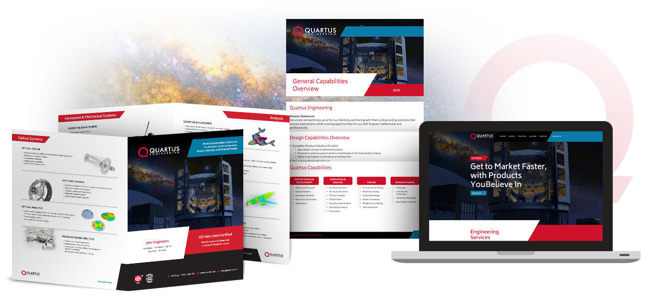
Quartus Engineering
Quartus was looking to update the look of its website to better match the high-tech nature of its company. They also wanted more of the personality of the people at the company to come across through a new design.
PINT came up with a unique look and feel for the website, playing off the angles of its logo, and brought in the personality Quartus desired.
We then expanded that design to other items such as PowerPoint templates and a new company brochure to make sure that there was consistency across all assets.
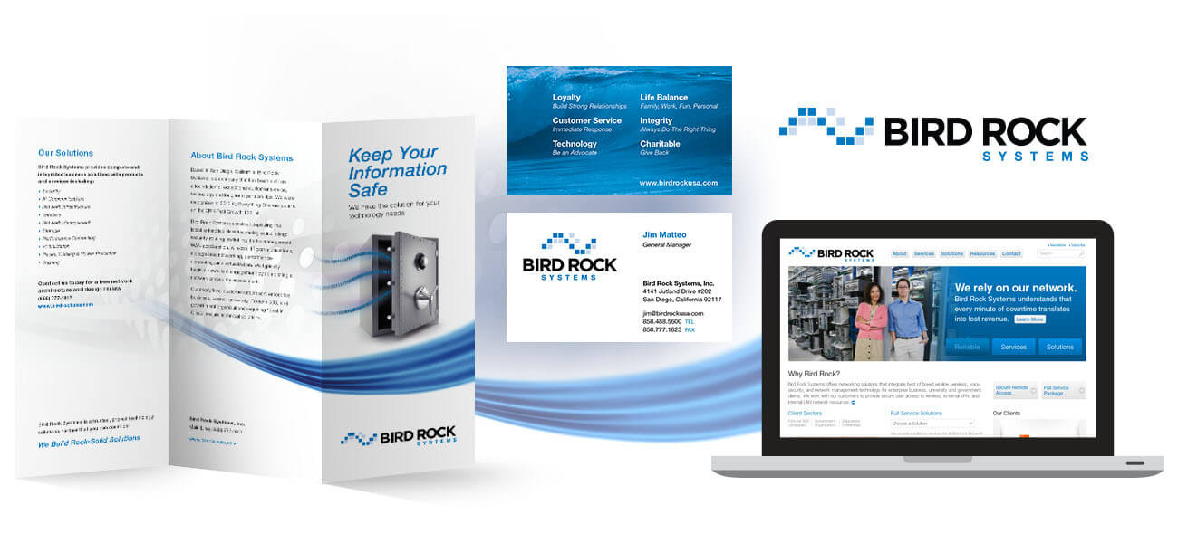
Bird Rock Systems
Bird Rock Systems initially engaged PINT to create a new logo and website. Bird Rock Systems is named after the Bird Rock neighborhood in La Jolla, San Diego, a beach community which is in turn named after an offshore rock in the shape of a bird. As such, the client wanted its new logo to have an ocean theme.
However, being an IT consultancy, a technical/digital theme was also important to convey. With that in mind, the PINT team got to work and ended up with a logo that symbolized a digital wave. Clean and crisp, it represented the feel the client wanted to portray.
From there, the PINT team also worked on creating business cards, a brochure and a new website to bring everything in line with the new look.
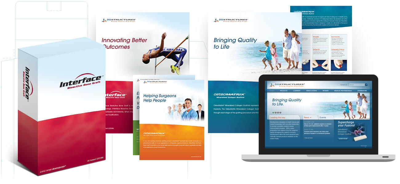
Biostructures
For Biostructures, we created the product packaging, brochures, and the website, bringing a unified theme and design through all pieces.
Different products utilized color that created themes between packaging and brochures to which the website also calls back.
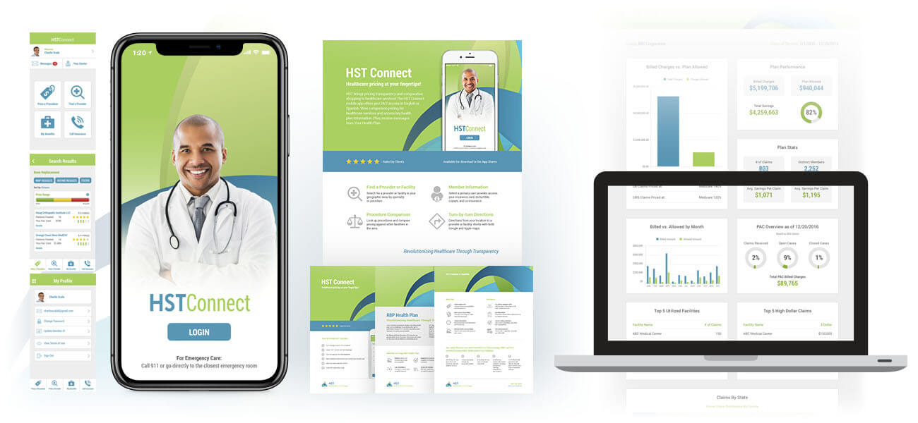
HST
HST provides reference-based pricing technologies that reduce healthcare claim costs. PINT helped HST redesign its mobile application to update the look-and-feel and fix UI (user interface) issues throughout the application.
Once these updates were finished, HST wanted to expand the new look throughout a number of print pieces, presentations, and an online dashboard. This involved designing all of the elements as well as setting font and color styles, iconography and graphics usage.
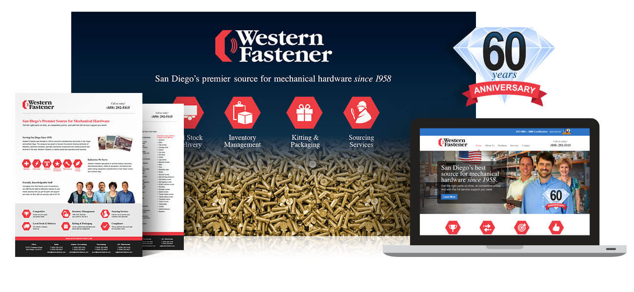
Western Fastener
Western Fastener has been in the mechanical hardware business since 1958 and first engaged PINT to help modernize many of its internal processes and bring them into the digital age.
From there, PINT revamped the Western Fastener digital image with a new website and updated its line card to match for distribution in printed form as well as via the website as a PDF. PINT then helped create a tradeshow booth backdrop that tied in with the new design using the iconography that PINT created.
Most recently, PINT helped Western Fastener celebrate its 60 year anniversary by creating a logo that could be used on the website and multiple other locations such as invoices and emails.
If you need help translating your brand and messaging across platforms, let us know through the form below.
Related Articles

ZOLL Data Systems Case Study
Project Summary In 2024, PINT and ZOLL Data Systems completed a project to redesign the ZOLL Data Systems website. The project originated from a desire...
5 Key Findings from a Recent Client Usability Study
Introduction Good usability within a website means that the user is able to use the interface to complete her/his tasks quickly and successfully. It is...
EDCO App Design and Development
Introduction Remember back in 2007 when Steve Jobs told us that iPhones didn’t need a bunch of apps? No? You’re forgiven if it’s been lost...