Blog

How to make Design Decisions from Behavioral Data
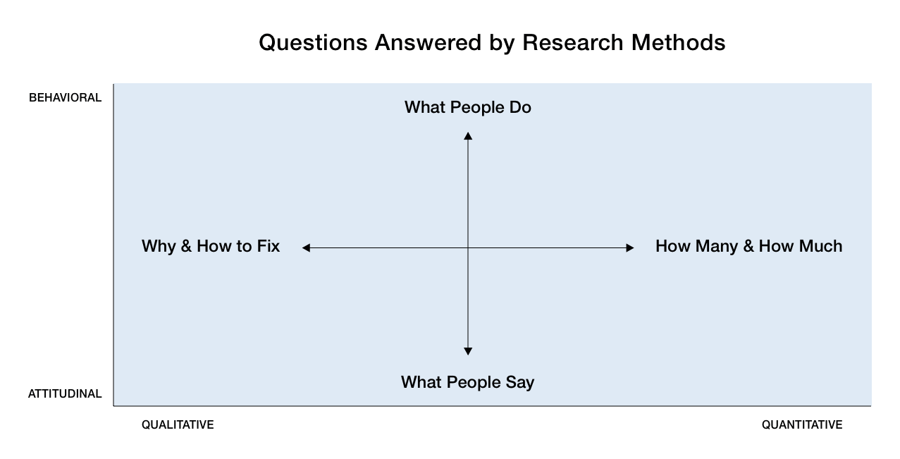
Research is critical to our user-centered design process at PINT. While every project is different, we like our user research to include some combination of attitudinal and behavioral data, as well as quantitative and qualitative data.
Attitudinal research centers on self-reported information and opinions (i.e., interviews, focus groups, surveys, etc.), while behavioral research shows us how people actually interact with a website (i.e. eyetracking, clickstream analysis, heatmaps, session playback, etc.).
Put simply, attitudinal is what users say, while behavioral is what users do. For this post, we’re focusing on the latter: How do we leverage behavioral data to inform our UX design decisions?
Our first step is always to determine which tools make the most sense based on the needs of the project.
Google Analytics is generally our go-to for quantitative data since it is robust, and we often utilize a session playback tool such as FullStory or LogRocket for qualitative data.
This combination of qualitative and quantitative behavioral data helps us paint a fuller picture of our client’s users: Google Analytics helps us answer the “Who”, “What”, “Where”, and “When” questions, while tools like LogRocket address the “How” (and sometimes the “Why”) questions:
- Who are your users (age, gender, job/industry, etc.)? Are they first-time or return visitors? Are they visiting your site on mobile, tablet, or desktop? What browsers are they using?
- What are they doing on the site? What pages do they visit? What tasks are they accomplishing? How long do they stay on the site, and how deep do they go?
- Where are your users coming from – Organic search, referral, direct, social, etc.? Also, where are they located in the world? Are there any cultural, geographic, or linguistic characteristics that might influence how they will use your site?
- When are they visiting the site? Not just in terms of times and weekdays, but also in the context of the user journey: When do they realize their needs? When do they discover your company or website? At one point do they actually decide to take actions like making a purchase (after their first visit, third visit, etc.)?
- Why are they using the site? Why are they visiting certain pages more than others? Why are they taking certain actions but not others (such as filling out a contact form or making a purchase)? Why are they spending so little time on certain pages? Why are they dropping off or bouncing at a certain page?
- How are they using the site? Are there common user flows or patterns that can be identified? Do they typically visit a certain page before another, or complete a certain task before another? Do they tend to scroll and read through everything first, or click through quickly? Are they interacting with UI elements as you would expect (nav items, buttons, forms, etc.)? Are they encountering any issues or roadblocks, such as slow site performance, unresponsiveness, or bugs?
The “Why” questions are difficult to answer when you’re relying on session playback tools. It won’t always be obvious why a user bounces from a page, stops filling out a contact form, or abandons a shopping cart. Maybe they spent very little time on a page because they’re just quickly scanning the site to get a feel for the company (they could be a job applicant trying to learn more about the product, instead of a potential customer looking to make a purchase).
But using context clues and UX heuristics, we can form reasonable assumptions and recommendations based on the behavioral data we collect and then test changes to prove or debunk our assumptions.
Quantitative Behavioral Data
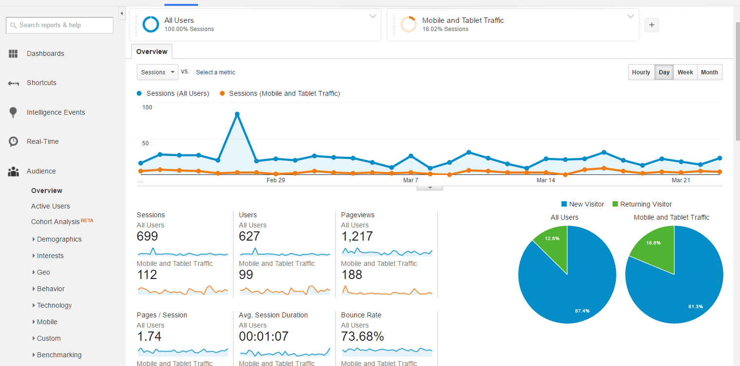
With a quantitative tool like Google Analytics, there is often a wide variety of metrics to wade through, so it’s important to identify the goals of your research upfront, and map these goals to the data that you will need.
For a recent client project, we were tasked with identifying the worst hurt areas of the website in order to make recommendations for improvement.
The client’s main site was pretty extensive, and they had a variety of internal and external microsites that we’d need to address as well (for their blog, foundation, careers, international users, internal employees, etc.). While the metrics we looked at would be slightly different depending on the goals of each of these sections, we primarily used Google Analytics’ pageviews, average time on page, bounce rates, exit rates, and event tracking.
Pageviews
Generally speaking, the “deeper” a page is in your site (i.e., the more clicks it takes to get to it), the fewer pageviews it will tend to have. This is why your homepage likely will have the most views. So when using this metric to gauge relative user interest in certain pages over others, it’s best to compare apples to apples – meaning comparing pages that live on the same level on your site, such as all your top-level pages accessed via the site navigation, or all your product pages.
Average Time on Page
This can be a tricky metric, because more average time on a page isn’t inherently “good” or “bad”. Some pages you expect users to spend more time (such as a longer blog article), while others you expect them to spend less (such as a quick signup page). So if the numbers aren’t what you’d expect based on the goals of that page, there is likely some room for improvement.
Event Tracking
These are specific site interactions that we set up to track through Google Analytics, such as clicking certain buttons, filling out forms, downloading PDFs, etc. These are probably the most straightforward metric to interpret: The higher the percentage of users completing these events, the better.
Bounce Rate
For all the sessions that started on a specific page, what percentage of sessions saw users leave the site from that same page without doing anything else?
Exit Rate
Of all the pageviews to a specific page, for what percentage was that page the last in the session?
Bounce Rate vs. Exit Rate
The key difference between the exit rate and the bounce rate is that the exit rate takes into account all sessions that include that page, whereas the bounce rate is only concerned with sessions that start with that page (Read up more on the difference here).
Both bounce rate and exit rate can help us gauge how relevant or effective a given page’s content is for the site’s visitors.
Note that a high exit rate might be expected for certain pages – typically the final page a user sees after a conversion, such as a purchase confirmation or a “Thanks for signing up!” screen.
But for any page on the site where you want users to drill deeper, high exit rates and bounce rates are generally a sign that something could be improved. The page content might not meet the user’s needs, or maybe they aren’t clear whether it does meet their needs due to usability issues, such as confusing navigation, ineffective site search, or unclear wording. Another reason could be poor site performance – slow loading times, frequent bugs and errors, etc. – which causes the user to give up out of frustration.
Taken together, these quantitative metrics can give us a good overview of the worst hurt areas of a site: Maybe your Contact form is getting fewer pageviews than you expected, or users aren’t purchasing a certain category of products as often as others.
But how do we start to piece together how users are navigating your site and why these areas are underperforming? That’s where a qualitative tool like LogRocket comes into play!
Qualitative Behavioral Data
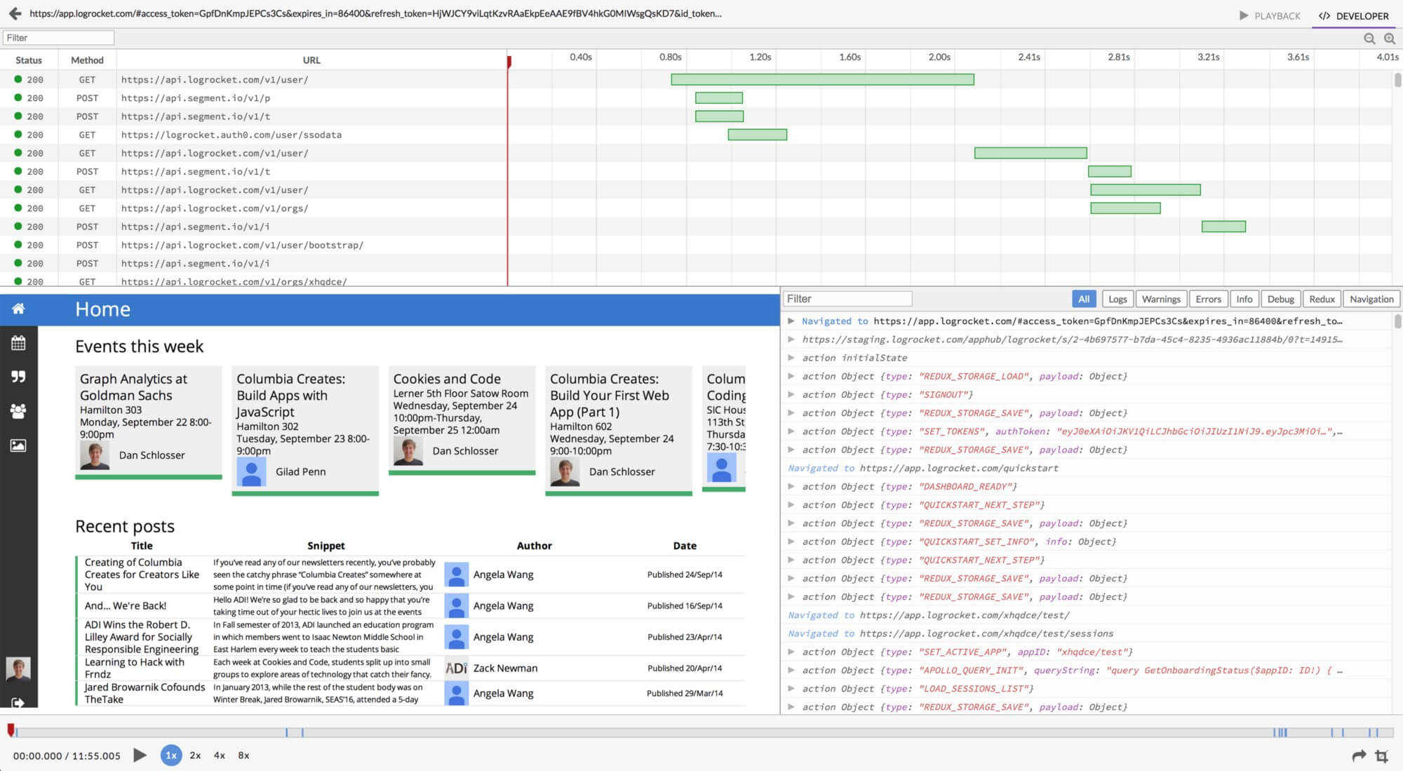
LogRocket is a session playback tool that allows you to watch screen recordings of visits to your site. While Google Analytics may tell us that 15% of visitors to your contact page actually submit the contact form, LogRocket can fill out more details about how users are filling out the form, and any errors or roadblocks they’re encountering that may drive them to exit before submitting.
Unlike a quantitative analytics tool where there are clear metrics and numbers to pick apart, a session playback tool can feel a bit more like the wild west; What do you focus on when you’re watching all these screen recordings? How do you synthesize your notes into actionable insights and recommendations?
Again, this goes back to understanding the goals of the project and client. If these objectives are more open-ended – such as identifying general areas for improvement – a good place to start is setting up filters for key user flows throughout the site.
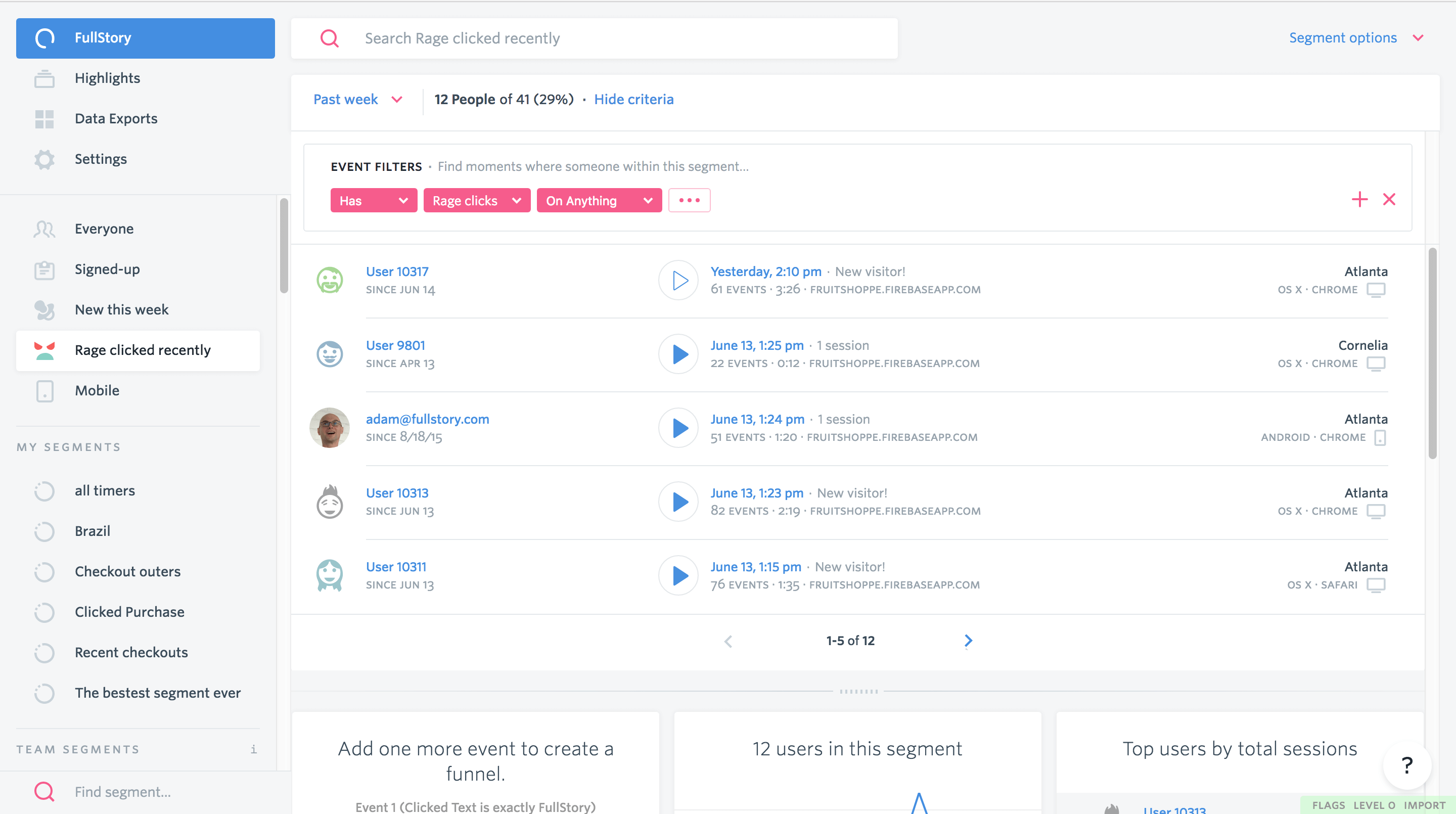
Applications like LogRocket and FullStory allow you to organize the screen recordings by a variety of demographic and behavioral segments.
For instance, you can look at mobile visitors who used your site’s search functionality, users who “rage clicked” (FullStory Feature) anywhere on your homepage, or Firefox users who spent more than five minutes on your pricing page.
The challenge with session playback tools is that they require a lot more time investment than a quantitative tool like Google Analytics; You have to watch a lot of screen recordings before you can start to see patterns in user behavior. But inevitably you will uncover some interesting commonalities among users that can drive insights for your website – often things that you hadn’t even considered.
When using LogRocket for the client project mentioned earlier, we noticed that a lot of users who visited the “Company” page scrolled quickly past all the text, paused at an illustration halfway down the page, and often clicked on various parts of the graphic (which isn’t actually clickable). We only intended the illustration to highlight key facts about the company, but many users seemed to think that clicking a fact would reveal more information.
This tells us that the site’s visitors preferred a more visual, interactive approach to learning about the company, rather than reading a lot of text.
Going forward, we could introduce some interactivity to this illustration by displaying information when users click the various facts. Not only would this reduce the overall text on the page, it would more closely align the behavior of visual elements on the page with the expectations of our users.
Conclusion
While attitudinal data from interviews and surveys is a key piece of the user research process, behavioral data is equally important in driving design decisions. What users say and what they do often differs quite a bit, so having insight into both will help strengthen your design recommendations. To recap our behavioral research process at PINT:
1. Determine the Goals
Determine the goals of the project and client. Understanding the information you are trying to uncover will help inform your research questions.
If the project goals are vague, a good place to start is with the primary site conversions:
- What does the client want users to accomplish on the site?
- How do they prioritize these tasks (subscribing to a newsletter, downloading a whitepaper, making a purchase, etc.)?
2. Narrow Down the Methods
Once you know your key research questions, you can begin narrowing down the methods you will use to gather behavioral data. If you aren’t able to directly observe your target audience using the website or product in question (which is often costly and time-consuming), the next best option is an indirect tool like the ones we’ve covered in this post.
A good rule of thumb is to include both quantitative and qualitative data, if possible.
3. Formulate a Plan
Formulate a plan for what metrics you will focus on with each tool. Otherwise, you may feel overwhelmed jumping in and trying to make sense of all the data it provides, especially with a robust tool like Google Analytics.
Impose some constraints on yourself and start small; You can always widen the scope of your research if needed!
4. Gather Data
Gather your data, and take note of common pitfalls or patterns with the metrics you’re using. The bounce rate may seem high, but is it higher than the industry average? The ideal average time on page may vary greatly depending on what kind of page it is, such as a lengthy blog post versus a quick signup screen. A top-level page will generally have more pageviews than a page found deeper in the site, so pageviews alone don’t indicate relative user interest. A user who skims through multiple pages without making a purchase could be a potential customer who didn’t find what they needed, or a prospective employee doing some research before an interview.
Sometimes data can be misleading, so don’t forget to check your assumptions along the way.
5. Synthesize
Synthesize your data into actionable insights and recommendations.
If you want to make data-informed decisions, but aren’t sure where to start, we can help. Tell us about it through the form below.
Related Articles

5 Key Findings from a Recent Client Usability Study
Introduction Good usability within a website means that the user is able to use the interface to complete her/his tasks quickly and successfully. It is...

Key Considerations for Investor Relations Websites
Creating an Investor Relations page that grabs the attention of various shareholders and instills confidence in your business is a crucial part of your company’s...

Human-Centered Web Design Begins with UX Research
At PINT, one of the first things we do when we start a web design project is determine what kind of design and marketing research...